Want to buy or sell something? Check the classifieds
  • The Fedora Lounge is supported in part by commission earning affiliate links sitewide. Please support us by using them. You may learn more here.

Art Fawcett VS Hall of Fame

1961MJS

My Mail is Forwarded Here
Messages
3,363
Location
Norman Oklahoma
HI Ordinary Guy, I like the hat a lot. Prior to seeing your hat I would have strongly considered buying a black hat with a Deep Maroon Ribbon and a matching brim. I'll leave it black now.

Later
 

toobacat

One of the Regulars
Messages
198
Location
Georgia
Black Beauty

A recent Crofut & Knapp refurbish by Art. Unfortunately, I didn't take a before picture.

10903563.jpg


10903672.jpg


Thanks Art!
 

fmw

One Too Many
Messages
1,017
Location
USA
I use a calibrated monitor and couldn't see any detail in your image. I reworked it to see it and (I hope you don't mind), posted it here. Very pretty hat. Fawcett does innovative and attractive hat band work.

crofut.jpg
 
Last edited:

daizawaguy

Call Me a Cab
Messages
2,661
Location
Tokyo
I use a calibrated monitor and couldn't see any detail in your image.

Now that`s interesting - If I could respectfully comment - I know nothing about calibrated monitors (apart from reading it on Google, and hearing that 99.9% of monitors are uncalibrated!?), but if that`s a black ribbon, then the original looks correct to me. If it`s grey, then the bottom one looks correct. Not sure how any details can be re-worked from a copy of a photo on line, without going back to the original data file.
 

fmw

One Too Many
Messages
1,017
Location
USA
Happy to oblige. Most monitors are "hot" or brighter than natural. The manufacturers adjust them that way at the factory. Since I do photography almost every day among other things, I calibrate my monitors so that they have accurate color rendition and are "neutral" rather than "hot." So my monitors are a little calmer than most. The result is that most images appear a bit dark because most people manipulate them on "hot" monitors. This one showed no detail at all on my monitor. I just saw a black image in the shape of a hat with a little gray arrow where the band is. I was interested in seeing what the hat looks like so I reduced the contrast, brightened it, and then added back in the contrast. That allowed me to see the crease and pinches and band and binding.

The problem you point out is very real. The band and binding are more light reflective. So, even if they are black, they will appear lighter than the felt which is less light reflective. The more I brighten, the greater the disparity in light value. There is no way to fix that from a downloaded image - at least without doing a lot of work on it in Photoshop. They may be black or gray. I don't know. I just know I couldn't see anything at all on my monitors even though the OP and you may have gotten some detail on your monitors. So I did what I could. It may be less accurate but it is visible.

The source of the image isn't all that important. The original probably has more resolution but not necessarily any more light value detail. So it is possible to bring up some of that detail with brightening. If you saw the image on my monitor, the difference would be very obvious. Obviously it would be better to have more exposure in the camera. I just did what I could with what I had.

Black and white are the toughest colors of all to render photographically. No doubt about it. We sometimes refer to a tough contrast problem as a black cat in a coal bin.
 

toobacat

One of the Regulars
Messages
198
Location
Georgia
fmw, see how this looks on your monitor. This is pretty much how it looks out of camera, with auto white balance adjustment. I think I darkened it a little trying to bring out the black color. I don't have a calibrated monitor though.

10903565.jpg
 

fmw

One Too Many
Messages
1,017
Location
USA
It is better and it demonstrates that the binding and band are black. I can tell that it has a teardrop crease but I can't see any other detail other than a wisp of light on the back of the hat band. Generally, you need to overexpose a shot like this by a stop and half to two stops. That resolves most everything right in the camera. The light that reaches the meter is dominated by everything around the hat. Since meters try to reduce everything to medium gray, they lie to us pretty badly with black or white subjects.

At any rate, it is an elegant lid to be sure.
 
Last edited:

fmw

One Too Many
Messages
1,017
Location
USA
Here's an example. This shot is of my Dobbs Beechwood fedora. It is black and has a black band. No binding, though, since it is a welted brim. You can see that everything is black but there is enough detail to make out what matters in viewing the image. This was overexposed 1 1/2 stops in the camera and photoshopped on a neutral monitor. The lighting is a light box with two studio strobes.

beechwood.jpg
 

EggHead

Practically Family
Messages
858
Location
San Francisco, CA
Toobacat, on my monitor your hat looks rich black with good details - like it supposed to look in the shade, fmw, your hat looks dark grey and artificially brightened up.
 

fmw

One Too Many
Messages
1,017
Location
USA
Actually both images are all gray in differing amounts. The differences are in the monitors. OK, I'll stop fooling with other people's images. Sorry. Won't bring it up again.
 

rlk

I'll Lock Up
Messages
6,100
Location
Evanston, IL
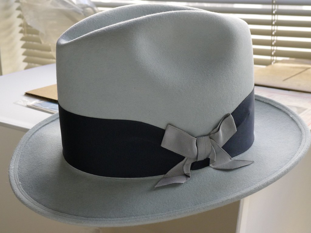
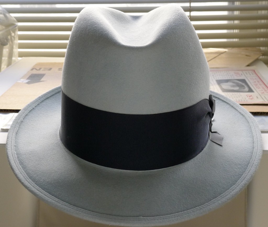
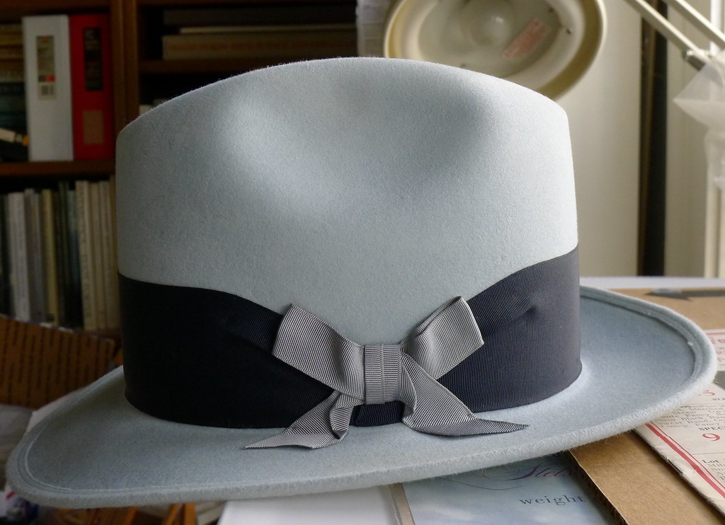
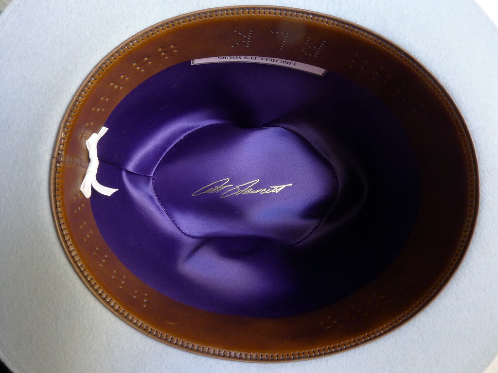
VS Powder Blue

5434240900_7b42ec0d7c_b.jpg


5433680369_4c6702370a_b.jpg


5433682273_b01c1d19aa_b.jpg


5433684323_90c54af058_b.jpg


5434238986_c7c2aecc23_z.jpg
5433929841_1c66c1f2b5_z.jpg


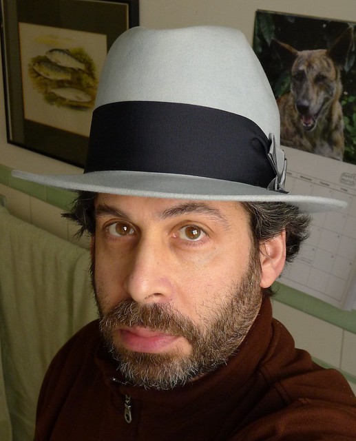
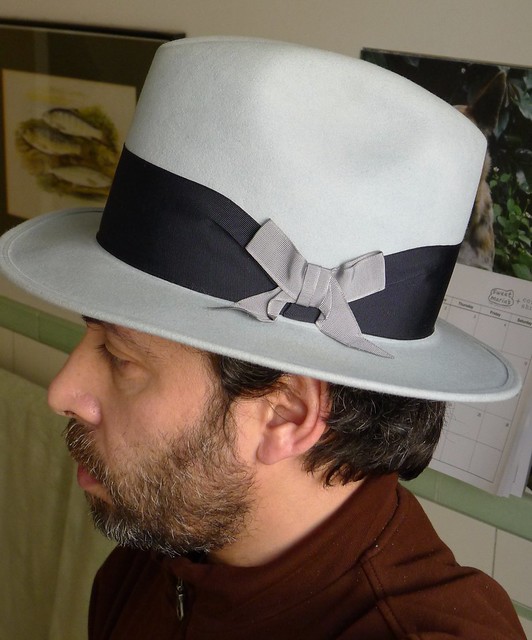
6" x 2-1/4" Art did some beautiful final detailing on the bow which is a particularly fine looking ribbon in color and texture. A special thank you to Art for his patience and persistence in getting this just right. Concept originates with a Mallory Hat of 1917. Not so simple to move from 2 dimensional artist's engraving to a real 3D object.
 
Last edited:

Forum statistics

Threads
107,219
Messages
3,031,364
Members
52,690
Latest member
biker uk
Top