How To Paint On A Leather Jacket, Part 1: Inspiration
Around here, we all love our WW2 flying jackets and the A2 in particular.
And some of us also love the nose- and jacket-art that adorned the fighters and bombers of the era too and the squadron patches and the fighter/bomb group patches and the pin-up girls and the names of the aircraft and even the colours and fonts - it all evokes a certain appeal of that era.
As a result, perhaps you have thought of wishing you would like to paint something like that on your jacket - to personalize it and make it truly unique in the world and undeniably your own?
That was just how I was feeling back in 1993. I had an Aviation Leathercraft A2 jacket and just felt it lacked ... something ... and I really just wished it could have some jacket art on it. But how would I go about doing that? Could I do it?
So back then, I went down to Hibbert Bros. on Surrey St. in Sheffield's city centre. Hibbert Bros. was a truly great art supply shop that had been there donkey's years when I was growing up - ands is sadly now long gone. But I went to ask about painting on a jacket and if they knew anything about how to do it. The two ladies behind the counter were great.
"Oh yes" they said. "We've had many bikers coming in here for years and asking the same thing and we sort them all out." That was encouraging!
And over about half an hour, they proceeded to tell me everything I needed to know on how to do the art myself - and I've followed their general instructions with every piece of jacket art I've done - and I have expanded upon it with my own acquired art skills and I now shall tell you what they told me and what I've learned.
Some thoughts on inspiration and what to paint...
But before all of that, I would say that there's the preliminary work to consider that is worth mentioning; namely how do you decide what to put on your A2 jacket?
Well, I'd suggest that it all starts with decent reference material. Try to get your hands on a few good books on WW2 insignia, aircraft nose art and of jacket art; the Maguire & Conway books such as “Art of the Flight Jacket” and “American Flight Jackets” (thanks again, Nick 123! You're the best!) are truly great. In there, you'll see dozens upon dozens of truly great and inspirational jackets of all the various theatres of war with the differing patches of various materials, some with minimal art works, others with a name of the aircraft on it in a nice 1940s font, others with a design and the lettering together and some with mission tallies of various styles.
With a tasty beverage and your feet up, enjoy slowly poring over them and make a note of those that appeal to your eye - and ask yourself why they appeal to you. Perhaps it’s just the name tag and patches, or the name that you find cool - or it's the font or colours that appeal - or the pin-up girl - or the aircraft that was painted on it and the angle/profile of it.
If it is the font only, you could copy it precisely - or write something else in that font but in a name that's personal to you. Enter "1940s fonts" into a search engine and you'll find loads on the web. Many are free and you can type in the name you want and the website will display that name in that font. You can adjust the size and then hit Print, et voila! Then you can simply take your hardcopy to a photocopier and adjust the copy size to fit the size of the jacket. Then you can get a tracing off that! It works for me every time and I've never paid for a font.
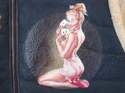
If it's the pin-up girl you are drawn to, ask yourself if it's the actual girl you like - or the style of the art/artist? You can find vintage pin-up girls galore online and in books such as “For The Boys – The Racy Pin-ups of World War II” (Collectors Press) and it may be worth looking at the other works of the artist to see if there is another that appeals more.
Personally, I'll add here that I find some (but by no means all) of the vintage pin-up art of the 1940s and early 1950s very appealing (and I make no apologies for it. Like all art, it is subjective) - but modern representations of nose art that adorn modern USAF aircraft leave me stone-cold. Back in the day, the girls were classy/cheeky and in accidental and innocent poses and they always left something to the imagination and were hand-painted. In contrast, the modern pin-ups that you see on B-52 bombers and A-10 Warthogs seek to emulate the era of days gone by, but by comparison, are totally unsatisfying (to me) in that the pin-ups are of a contemporary look – less innocent and more like a professional "dancer" (stripper) than the girl-next-door or office secretary - and are sometimes quite lewd and are always airbrushed (which imbues another distinct change in character of the art); all of which lacks any charm whatsoever for me. But that's just me.
Therefore, try hunting down the artist and the original work you are after as greater details and colour balance can be seen on-line or on another print, depending on the image resolution. Get the best you can acquire and I'd suggest spending some money there if you need to as it will reward you later.
If it’s the squadron and group patches you like, then the “Battle Colors: Insignia and Aircraft Markings of the U.S. Air Force in WW2” (Robert A. Watkins, Schiffer Military History) series of books are truly indispensable and mine have paid for themselves many times over and I couldn’t possibly have done what I’ve done without them.
As for the name for your jacket, I'd suggest keeping a list of names that you would put on an aircraft as if it was you flying in it. What would you suggest to your crew as a possible name? I kept a list for years in an old notebook and would simply add to it as the names came to me and I'd think "Man! That'd be sooo cool to have that on a jacket!" and into the list it would go for another day ....
In the instance of my latest jacket design to be painted, some of you will recall my tale of how Willow, one our rescue dogs from Texas, fell through the ice on a nearby frozen river on a Winter pre-dawn dog walk and I had to lower myself down a steep bank and into the chest-deep icy water to push her out - which suddenly left me in the same predicament as her of how to get out!!! Without regaling the full story again, I broke some ice to get upstream to a better part of the steep bank with tree roots so I could grab hold of them and lift myself up and clambered out and made it home in the -25C wind-chill - and I mentioned it here purely to relate how my ELC Irvin/C-3 and Buzz A-10 gloves fared in extreme conditions, as I know I wore them in rather unusual circumstances.
The story got all very nice replies and the general response was "Man, she's a lucky dog. You were both lucky!"
And it got me thinking that I was a lucky dog too!
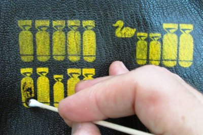
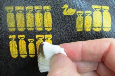
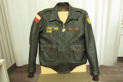
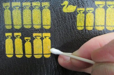
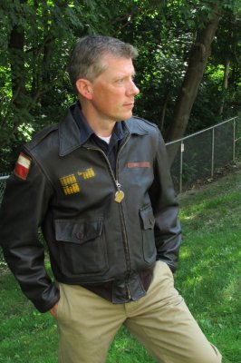
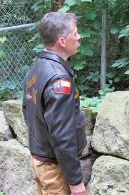
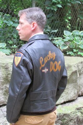
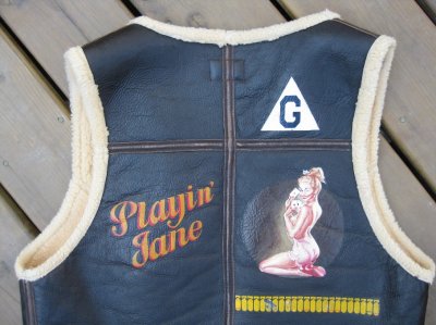
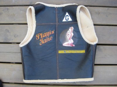
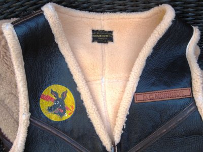
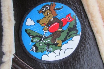
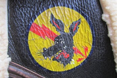
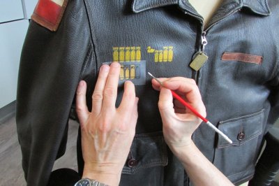
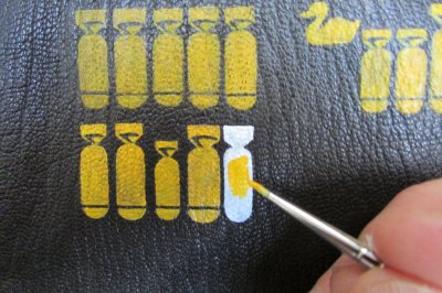
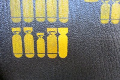
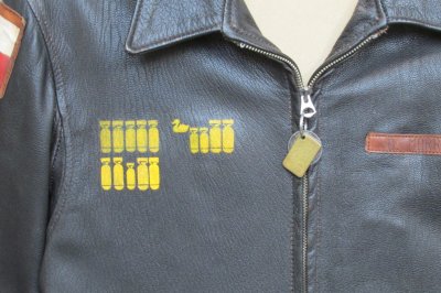
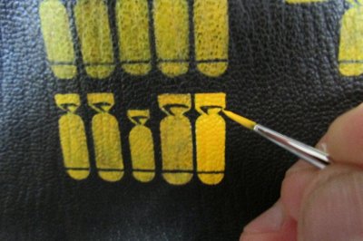
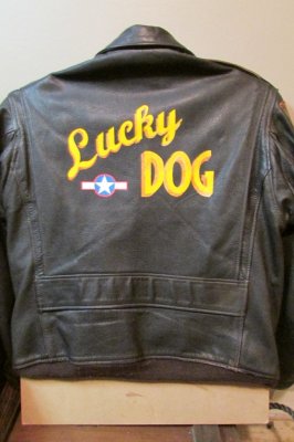
As stated here on my first post, my Aero ANJ-3 jacket art is based on an original ANJ-3 that had been on display at LAX airport and had very cool MTO theatre-made leather patches and bomb tallies painted on the front-right panel - and I added my mission tallies to represent all the animals that my girlfriend and I had had together over the years. Saving one dog in particular from Texas started all this jacket art - we called him Bo - and he was our first rescue from Texas; hence the Lone Star State leather patch (a copy of an original) and his rabies tag and shelter ID tag became the zip pullers and I had his shelter ID number stenciled into the lining of the jacket with a 0- prefix so it would look like the serial numbers seen on the tails of USAAF bombers.
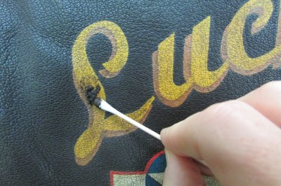
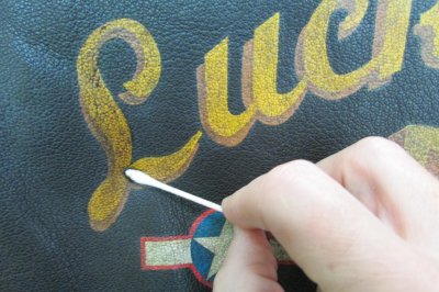
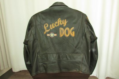
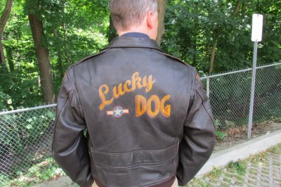
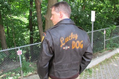
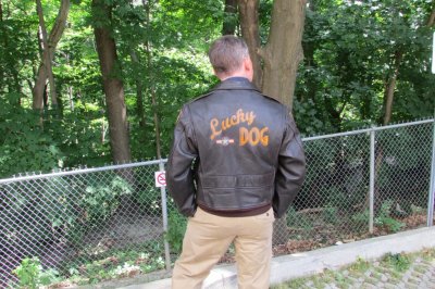
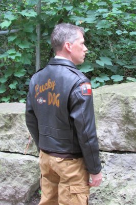
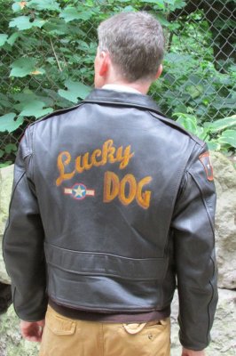
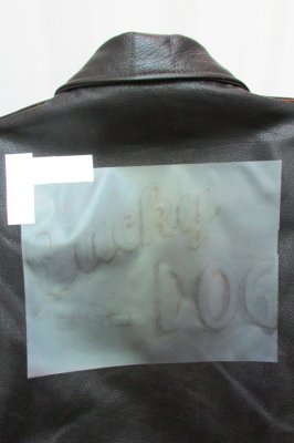
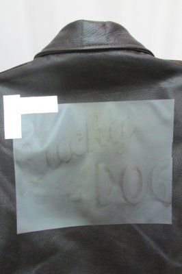
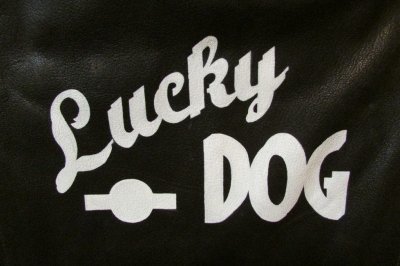
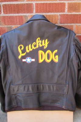
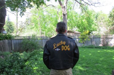
And suddenly, after that morning, I knew I wanted to paint on the back panel to commemorate this very cold brush with danger that Willow and I had together: and so Lucky Dog was the name.
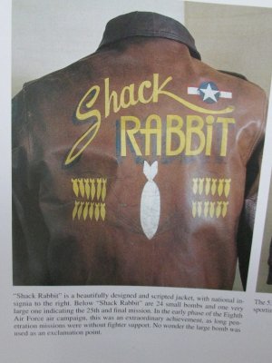
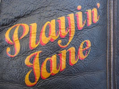
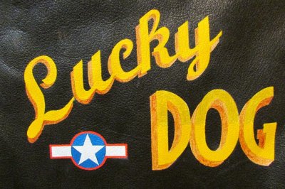
So I went through all my reference books and found a design on an A2 that really appealed and the one I liked was “Shack Rabbit”.
View attachment 32606
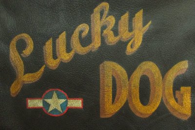
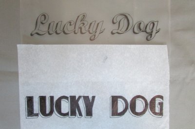
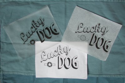
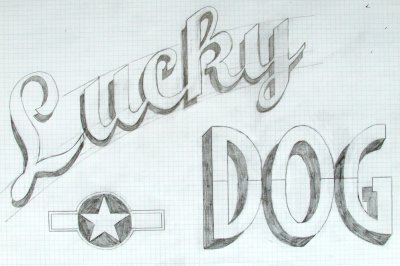
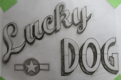
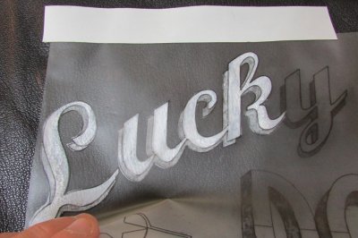
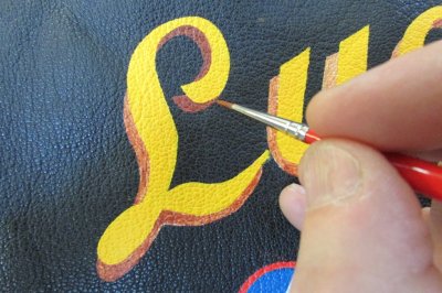
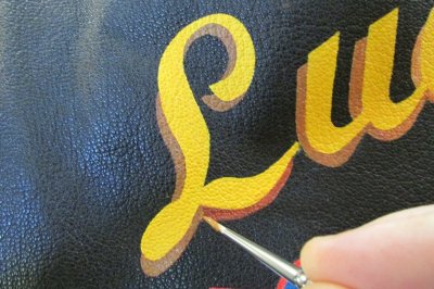
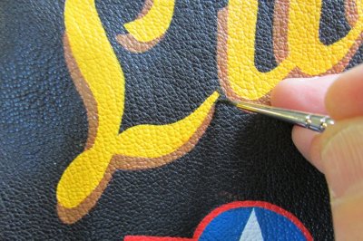
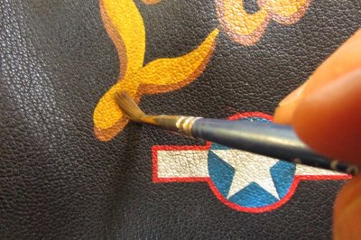
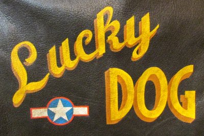
So with that for my inspiration, I abandoned my simple text ideas and I created the name Lucky (instead of Shack) - in the same (but very similar to Shack Rabbit) cursive font as my first work “Stand By” (as a sort of homage) - and worked it up from a free font online.
View attachment 32607 View attachment 32608
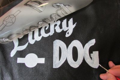
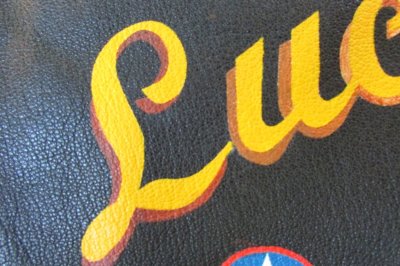
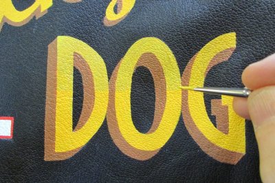
The DOG part was also created from a free 1940s font that almost perfectly matched the original font of Shack Rabbit.
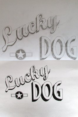
Again, both were sized to match using a photocopier and it became a simple but patient matter of working them together to get the right size and in relation to the other.
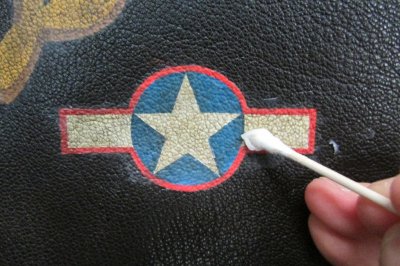
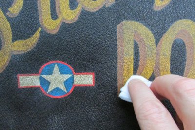
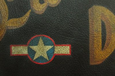
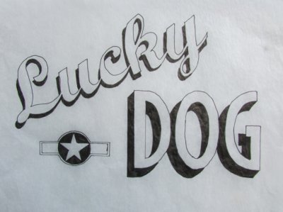
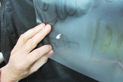
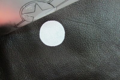
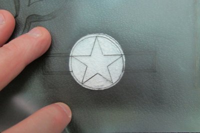
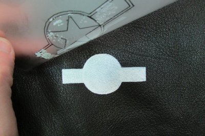
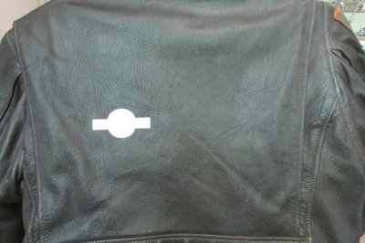
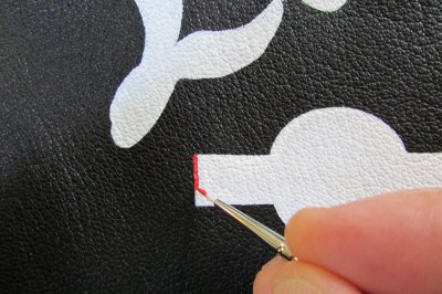
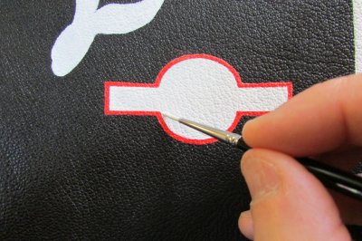
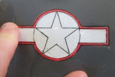
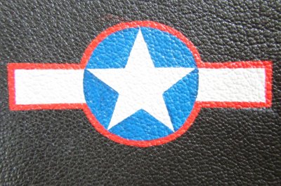
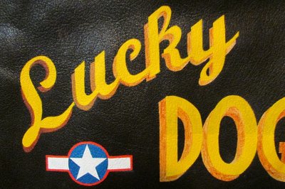
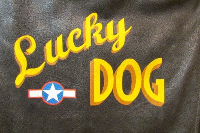
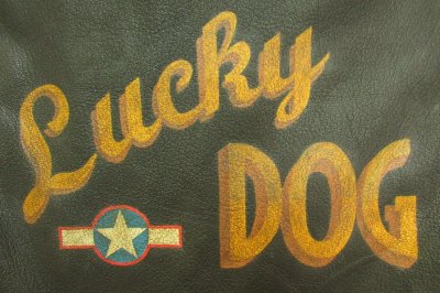
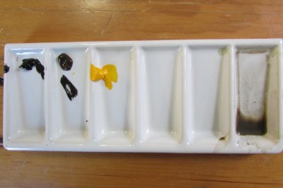
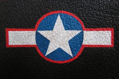
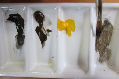
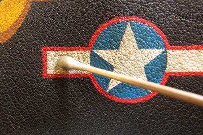
As my ANJ-3 is a jacket design unique to 1943, I chose to add the USAAF "Star and Bar" (as seen on Shack Rabbit) but the type appropriate to that year and I added it and moved it over and sized it appropriately to balance the design a bit.
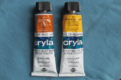
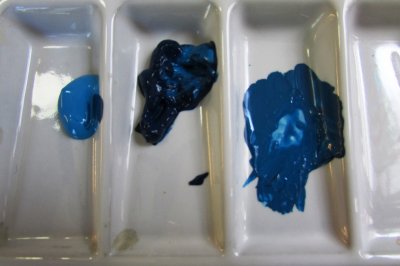
Another difference is in the colours I’ll use. The original Shack Rabbit lettering appears to be cadmium yellow deep with a black drop-shadow, which is fine as the jacket is russet. However, my ANJ-3 is very dark brown and any black paint would disappear into it and barely be seen, so I chose to use a lighter burnt sienna as it’s a nice complementary colour to the cadmium yellow deep and is reminiscent of that era.
View attachment 32609
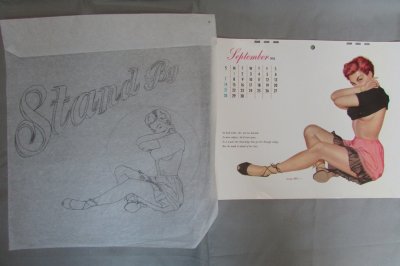
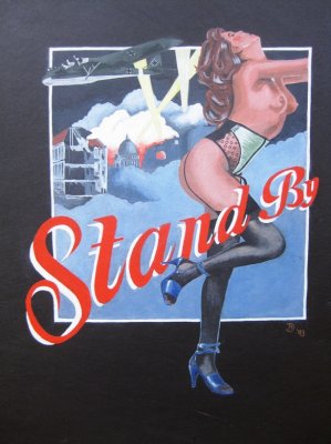
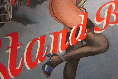
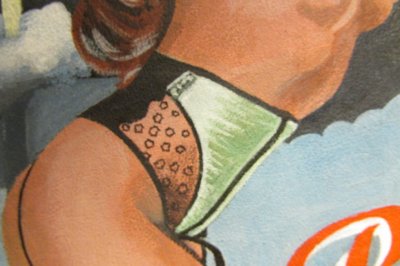
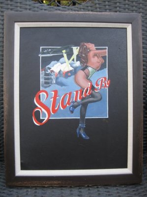
And yet, I still feel like doing a new version of Stand By – but adding Esquire’s Miss September, 1952. I got an original sheet of the calendar from eBay and it’s amazing how much more detail there is than the illustration I first saw in a book, but the blacks of her strappy shoes and pullover really lend it more to a russet jacket, I think, so they’ll stand out more. A design for another day and another jacket, I think.
View attachment 32605
But you can see how the choice isn’t easy. And that part I can’t help you with either!
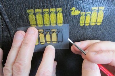
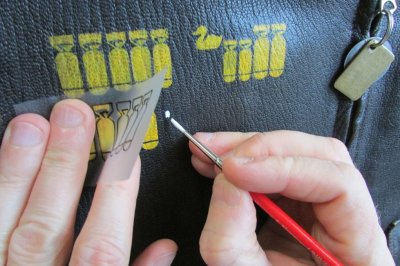
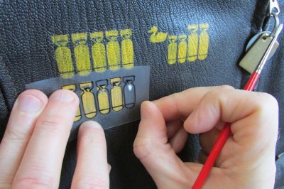
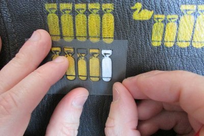
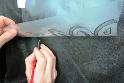
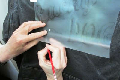
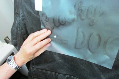
And with that all prepared, then I made my stencil - and that's what I'll explain next ...
End of part 1.
Around here, we all love our WW2 flying jackets and the A2 in particular.
And some of us also love the nose- and jacket-art that adorned the fighters and bombers of the era too and the squadron patches and the fighter/bomb group patches and the pin-up girls and the names of the aircraft and even the colours and fonts - it all evokes a certain appeal of that era.
As a result, perhaps you have thought of wishing you would like to paint something like that on your jacket - to personalize it and make it truly unique in the world and undeniably your own?
That was just how I was feeling back in 1993. I had an Aviation Leathercraft A2 jacket and just felt it lacked ... something ... and I really just wished it could have some jacket art on it. But how would I go about doing that? Could I do it?
So back then, I went down to Hibbert Bros. on Surrey St. in Sheffield's city centre. Hibbert Bros. was a truly great art supply shop that had been there donkey's years when I was growing up - ands is sadly now long gone. But I went to ask about painting on a jacket and if they knew anything about how to do it. The two ladies behind the counter were great.
"Oh yes" they said. "We've had many bikers coming in here for years and asking the same thing and we sort them all out." That was encouraging!
And over about half an hour, they proceeded to tell me everything I needed to know on how to do the art myself - and I've followed their general instructions with every piece of jacket art I've done - and I have expanded upon it with my own acquired art skills and I now shall tell you what they told me and what I've learned.
Some thoughts on inspiration and what to paint...
But before all of that, I would say that there's the preliminary work to consider that is worth mentioning; namely how do you decide what to put on your A2 jacket?
Well, I'd suggest that it all starts with decent reference material. Try to get your hands on a few good books on WW2 insignia, aircraft nose art and of jacket art; the Maguire & Conway books such as “Art of the Flight Jacket” and “American Flight Jackets” (thanks again, Nick 123! You're the best!) are truly great. In there, you'll see dozens upon dozens of truly great and inspirational jackets of all the various theatres of war with the differing patches of various materials, some with minimal art works, others with a name of the aircraft on it in a nice 1940s font, others with a design and the lettering together and some with mission tallies of various styles.
With a tasty beverage and your feet up, enjoy slowly poring over them and make a note of those that appeal to your eye - and ask yourself why they appeal to you. Perhaps it’s just the name tag and patches, or the name that you find cool - or it's the font or colours that appeal - or the pin-up girl - or the aircraft that was painted on it and the angle/profile of it.
If it is the font only, you could copy it precisely - or write something else in that font but in a name that's personal to you. Enter "1940s fonts" into a search engine and you'll find loads on the web. Many are free and you can type in the name you want and the website will display that name in that font. You can adjust the size and then hit Print, et voila! Then you can simply take your hardcopy to a photocopier and adjust the copy size to fit the size of the jacket. Then you can get a tracing off that! It works for me every time and I've never paid for a font.
If it's the pin-up girl you are drawn to, ask yourself if it's the actual girl you like - or the style of the art/artist? You can find vintage pin-up girls galore online and in books such as “For The Boys – The Racy Pin-ups of World War II” (Collectors Press) and it may be worth looking at the other works of the artist to see if there is another that appeals more.
Personally, I'll add here that I find some (but by no means all) of the vintage pin-up art of the 1940s and early 1950s very appealing (and I make no apologies for it. Like all art, it is subjective) - but modern representations of nose art that adorn modern USAF aircraft leave me stone-cold. Back in the day, the girls were classy/cheeky and in accidental and innocent poses and they always left something to the imagination and were hand-painted. In contrast, the modern pin-ups that you see on B-52 bombers and A-10 Warthogs seek to emulate the era of days gone by, but by comparison, are totally unsatisfying (to me) in that the pin-ups are of a contemporary look – less innocent and more like a professional "dancer" (stripper) than the girl-next-door or office secretary - and are sometimes quite lewd and are always airbrushed (which imbues another distinct change in character of the art); all of which lacks any charm whatsoever for me. But that's just me.
Therefore, try hunting down the artist and the original work you are after as greater details and colour balance can be seen on-line or on another print, depending on the image resolution. Get the best you can acquire and I'd suggest spending some money there if you need to as it will reward you later.
If it’s the squadron and group patches you like, then the “Battle Colors: Insignia and Aircraft Markings of the U.S. Air Force in WW2” (Robert A. Watkins, Schiffer Military History) series of books are truly indispensable and mine have paid for themselves many times over and I couldn’t possibly have done what I’ve done without them.
As for the name for your jacket, I'd suggest keeping a list of names that you would put on an aircraft as if it was you flying in it. What would you suggest to your crew as a possible name? I kept a list for years in an old notebook and would simply add to it as the names came to me and I'd think "Man! That'd be sooo cool to have that on a jacket!" and into the list it would go for another day ....
In the instance of my latest jacket design to be painted, some of you will recall my tale of how Willow, one our rescue dogs from Texas, fell through the ice on a nearby frozen river on a Winter pre-dawn dog walk and I had to lower myself down a steep bank and into the chest-deep icy water to push her out - which suddenly left me in the same predicament as her of how to get out!!! Without regaling the full story again, I broke some ice to get upstream to a better part of the steep bank with tree roots so I could grab hold of them and lift myself up and clambered out and made it home in the -25C wind-chill - and I mentioned it here purely to relate how my ELC Irvin/C-3 and Buzz A-10 gloves fared in extreme conditions, as I know I wore them in rather unusual circumstances.
The story got all very nice replies and the general response was "Man, she's a lucky dog. You were both lucky!"
And it got me thinking that I was a lucky dog too!
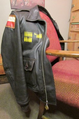
As stated here on my first post, my Aero ANJ-3 jacket art is based on an original ANJ-3 that had been on display at LAX airport and had very cool MTO theatre-made leather patches and bomb tallies painted on the front-right panel - and I added my mission tallies to represent all the animals that my girlfriend and I had had together over the years. Saving one dog in particular from Texas started all this jacket art - we called him Bo - and he was our first rescue from Texas; hence the Lone Star State leather patch (a copy of an original) and his rabies tag and shelter ID tag became the zip pullers and I had his shelter ID number stenciled into the lining of the jacket with a 0- prefix so it would look like the serial numbers seen on the tails of USAAF bombers.
And suddenly, after that morning, I knew I wanted to paint on the back panel to commemorate this very cold brush with danger that Willow and I had together: and so Lucky Dog was the name.
So I went through all my reference books and found a design on an A2 that really appealed and the one I liked was “Shack Rabbit”.
View attachment 32606
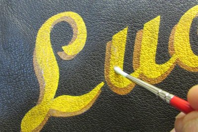
So with that for my inspiration, I abandoned my simple text ideas and I created the name Lucky (instead of Shack) - in the same (but very similar to Shack Rabbit) cursive font as my first work “Stand By” (as a sort of homage) - and worked it up from a free font online.
View attachment 32607 View attachment 32608
The DOG part was also created from a free 1940s font that almost perfectly matched the original font of Shack Rabbit.
Again, both were sized to match using a photocopier and it became a simple but patient matter of working them together to get the right size and in relation to the other.
As my ANJ-3 is a jacket design unique to 1943, I chose to add the USAAF "Star and Bar" (as seen on Shack Rabbit) but the type appropriate to that year and I added it and moved it over and sized it appropriately to balance the design a bit.
Another difference is in the colours I’ll use. The original Shack Rabbit lettering appears to be cadmium yellow deep with a black drop-shadow, which is fine as the jacket is russet. However, my ANJ-3 is very dark brown and any black paint would disappear into it and barely be seen, so I chose to use a lighter burnt sienna as it’s a nice complementary colour to the cadmium yellow deep and is reminiscent of that era.
View attachment 32609
And yet, I still feel like doing a new version of Stand By – but adding Esquire’s Miss September, 1952. I got an original sheet of the calendar from eBay and it’s amazing how much more detail there is than the illustration I first saw in a book, but the blacks of her strappy shoes and pullover really lend it more to a russet jacket, I think, so they’ll stand out more. A design for another day and another jacket, I think.
View attachment 32605
But you can see how the choice isn’t easy. And that part I can’t help you with either!
And with that all prepared, then I made my stencil - and that's what I'll explain next ...
End of part 1.


")