Want to buy or sell something? Check the classifieds
  • The Fedora Lounge is supported in part by commission earning affiliate links sitewide. Please support us by using them. You may learn more here.

Bound Grosgrain Edges - Need Inspiration

Alive'n'Amplified

Call Me a Cab
Messages
2,032
Location
Atlanta, GA
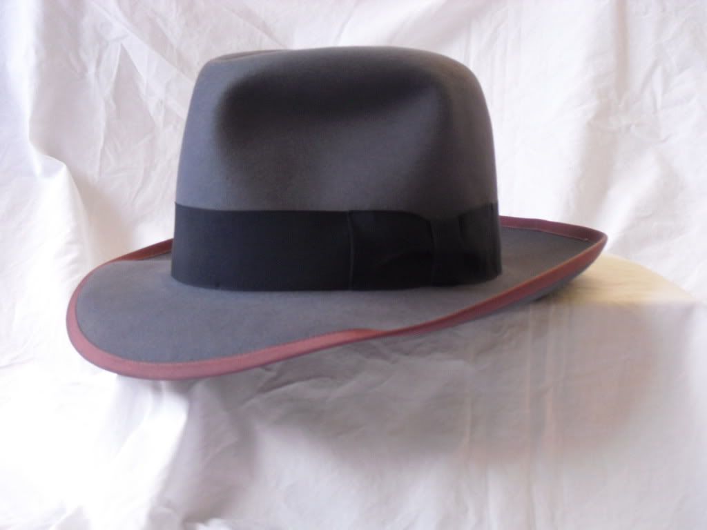
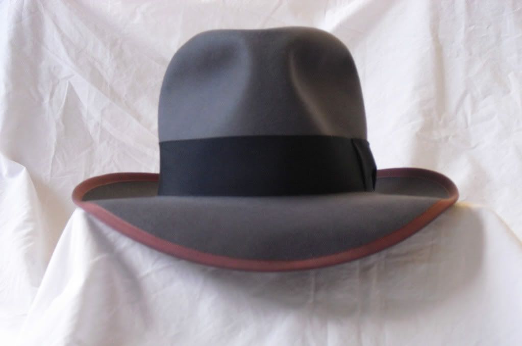
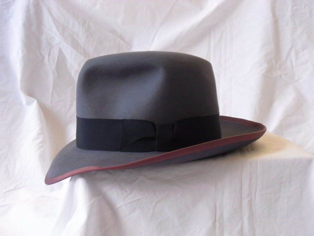
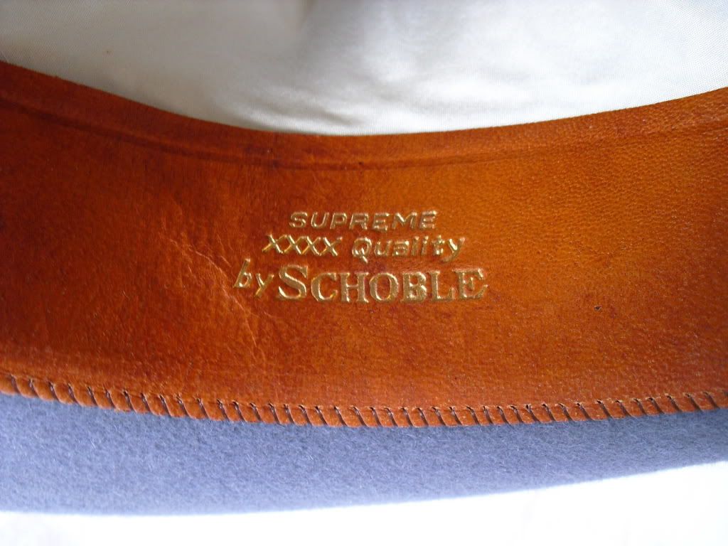
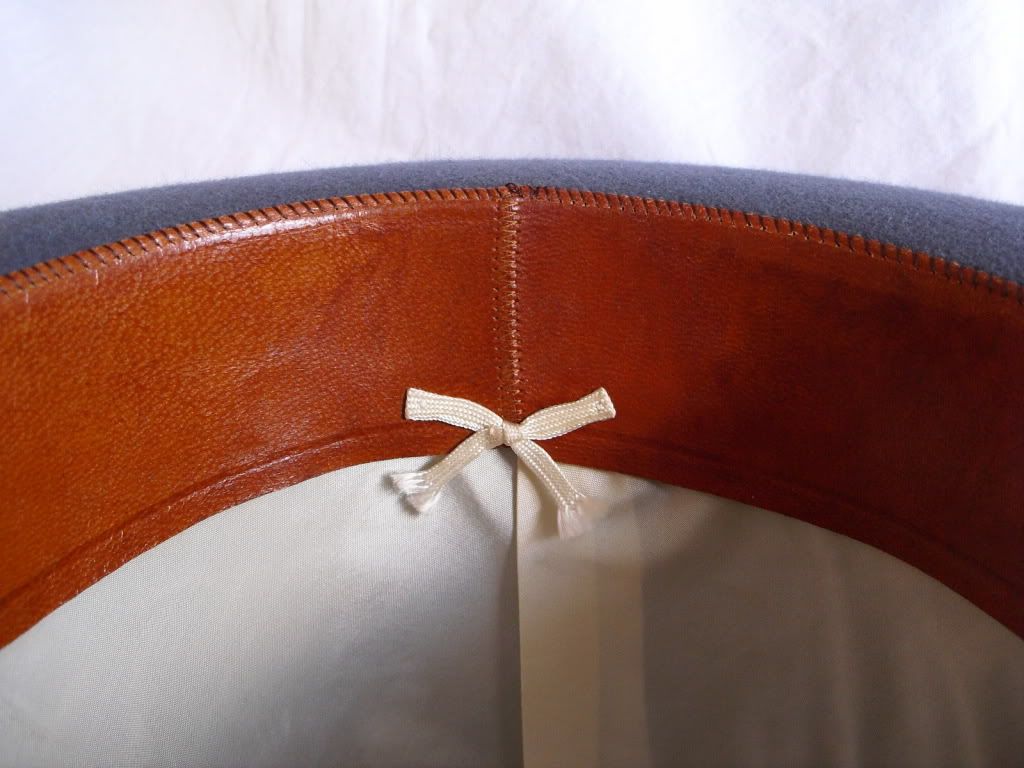
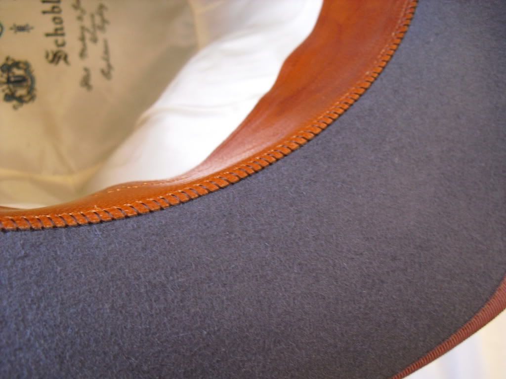
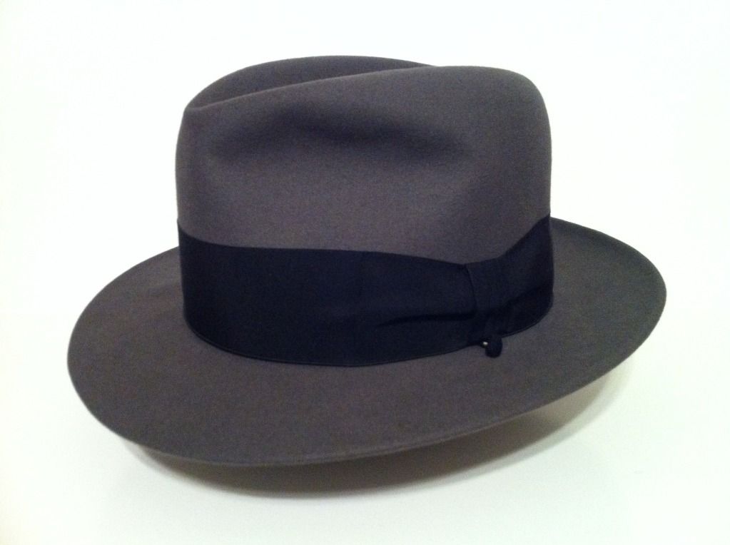
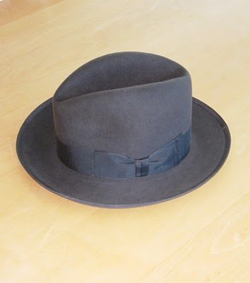
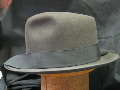
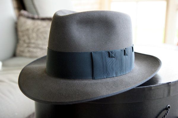
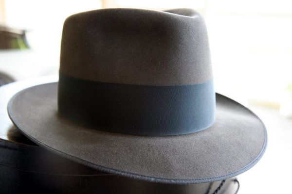
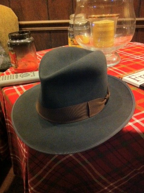
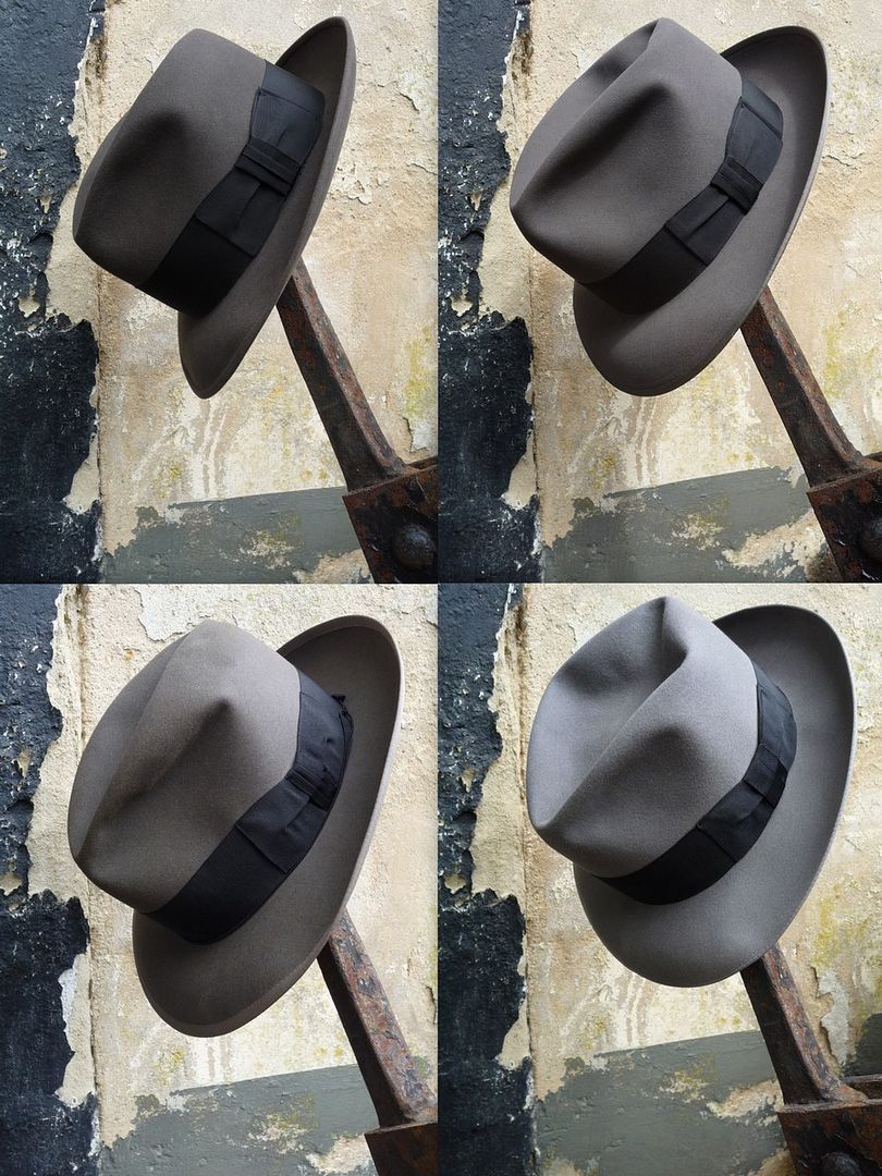
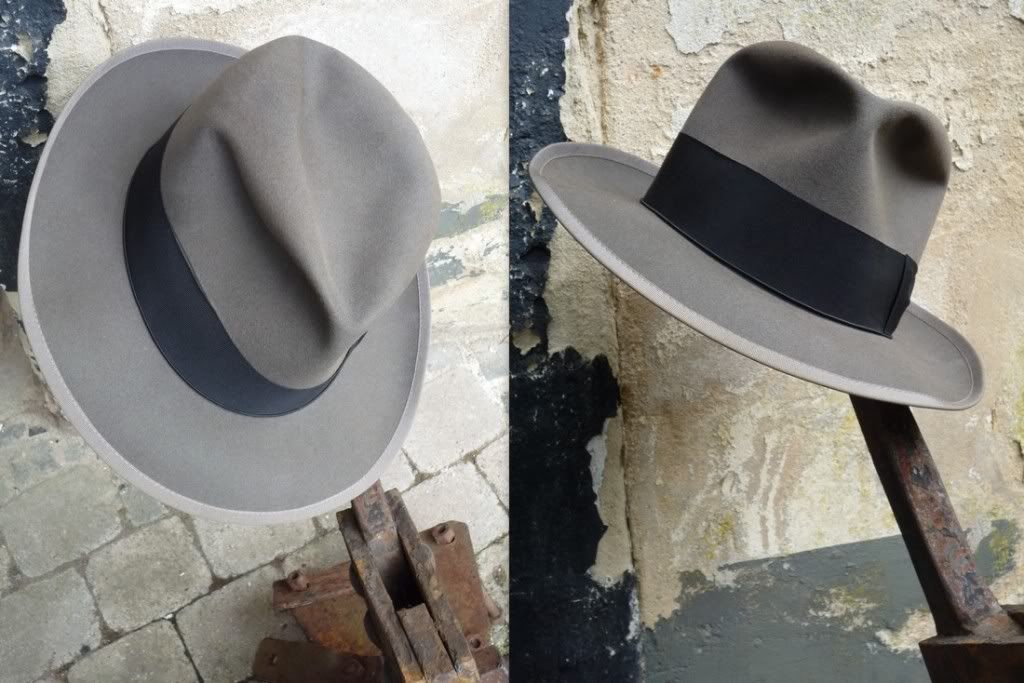
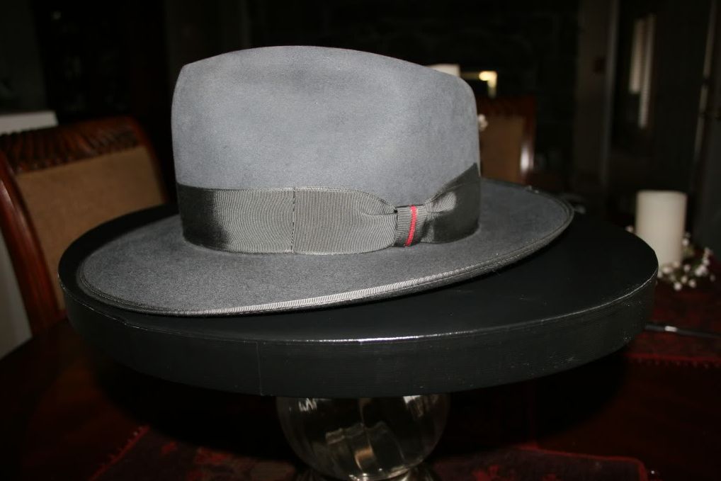
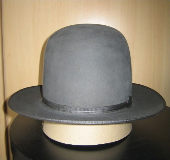
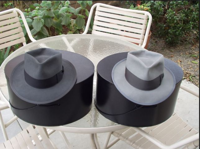
I have several grey hats, so I'm going to add a binding to this charcoal fedora to set it apart from the others. Can you post some shots if you have a similar grey hat with silver or tan/gold grosgrain edge binding? I think I would like it with a tan/gold trim, but I just can't visualize it to seal the deal, so I'd like to see what it will look like. Thanks!

14A59857.jpg
 

Rabbit

Call Me a Cab
Messages
2,561
Location
Germany
I recommend a matching or slightly lighter binding. Charcoal being a very sober felt color, a higher contrast - be it darker or lighter than the felt - will look, well, cheap.
Here is a VS in Winchester's charcoal felt with matching binding and charcoal band. Due to the respective light reflecting properties of felt and grosgrain, the band appears still darker than the felt. The binding might very well be a shade or two lighter than the band, approximating the felt color more closely.

WB_Finishedhat.jpg


WBribbonfinal.jpg


More VSs in charcoal felt with matching binding (none of them in tan/gold, though):

charcoal_graphite-ribbon_366523171.jpg

charcoal_graphite-ribbon_366523155.jpg


charcoal_dkcopper-ribbon.jpg


Below are some pictures of darker mid grey hats of mine with matching silver bindings. Note that they're not actually charcoal. The upper left one with cavanagh edge is the only one with actual charcoal felt, for color reference.

Knox_Resistol_Borso_Borso-post.jpg


See also the high-res images:
Borsalino Gorasgu - Amitata c. Nero
Borsalino Natalsca - Bismuto c. Nero
Resistol Melorol mid50s

I believe there would be less leeway for the color temperature of bindings for a charcoal felt, but a warm shade of silver-grey as on the Borsalino below might work as long as it's still fairly close to the felt color. I hesitate to call the binding on this Borsalino tan/gold since it is so dark.

BorsalinoGorasgu-AmitatacNero_binding-post.jpg


Edit:
Here are some VS hats in Winchester Steel, which has about the same light value as the charcoal felt, but with a discernible shift towards the blue spectrum which practically rules out tan/gold bindings. All of the bindings are matching the felt.

22.jpg


steel_Picture452.jpg


Steel (left) with Blue Smoke:

steel_bluesmoke_I.jpg
 
Last edited:

Rabbit

Call Me a Cab
Messages
2,561
Location
Germany
I was hoping you would chime in, Nik. Great combos! I like the contrast on the Borso. That's the look I would prefer.

That would have been my preference as well, A'n'A. I'd make sure to get an analogue amount of contrast for the darker felt of your hat in question.
 

Alive'n'Amplified

Call Me a Cab
Messages
2,032
Location
Atlanta, GA
I was up late last night compiling a bunch of ribbon / felt combinations. Here are the examples that I've narrowed it down to, so far. After some back and forth between matching / contrasting ribbon, I decided that I really want to have a contrast. I don't want the edge to blend in and continue with the same color. After all, I'm wanting to set this apart from my other grey hats. The hat pic is very accurate to the actual felt color.

My "safe" choices range from gold to taupe. The others have more color. Let me know your thoughts, everyone!


Satin / Grosgrain Antique Gold - This is a satin / grosgrain combination. The satin finish would be on the edge as the ribbon is folded over the brim. The grain would be on the outside, stitched to the felt.

Borso-SGAntiqueGold.jpg


Satin Pecan - This is an all satin ribbon, that will give it a very smooth appearance. Is this a wise choice for an edge? Or is it too much?

Borso-SatinPecan.jpg


Taupe - A solid grosgrain. This is definitely a safe and neutral color, and it will be easy to wear.

Borso-SolidTaupe.jpg


Williamsburg Blue - Another solid grosgrain. This has a muted and almost smokey tint to it. I wear a lot of blue, and I think this stands out nicely for a very unique appearance.

Borso-SolidWilliamsburg.jpg


Terra Cotta - Grosgrain, and very unique. The pinkish color provides a great contrast!

Borso-TerraCotta.jpg
 

Rabbit

Call Me a Cab
Messages
2,561
Location
Germany
I would go easy on the contrast binding, but that's a personal preference. Still, I suggest you make sure that you choose a contrast ribbon because it really works well, not just because you can.

This Schoble Supreme XXXX Quality w/ dk.blue ribbon with maroon binding in a darker steel-like felt color might be useful to visualize a reddish band. I saw it on Ebay some time ago; I never saw a color combination quite like it. Well done if you ask me.

T2eC16NzEE9s3WpB7BQFb2i6d60_57.jpg


KGrHqVicFH365EhBQFb2yEYe60_57.jpg


KGrHqJnwFIQzfwM7BQFb2f37H60_57.jpg


KGrHqNrMEoMvE2nBQFb3Wf260_57.jpg


KGrHqRmFBqYVQgBQFb3ZkYc60_57.jpg


T2eC16JyME9s5qF2OBBQFb3cs0Nw60_57.jpg


T2eC16Nw0E9szNmjBQFb3sWy7g60_57.jpg


T2eC16ZzcE9s4g3IcBQFb3ITqdQ60_57.jpg
 

m0nk

One Too Many
Messages
1,004
Location
Camp Hill, Pa
Personally, I like the gold or the blue. I've been considering doing the same to my moonstone Fed IV, but will likely just end up getting a custom hat with the bound edge.
 

Rabbit

Call Me a Cab
Messages
2,561
Location
Germany
I was up late last night compiling a bunch of ribbon / felt combinations. Here are the examples that I've narrowed it down to, so far. After some back and forth between matching / contrasting ribbon, I decided that I really want to have a contrast. I don't want the edge to blend in and continue with the same color. After all, I'm wanting to set this apart from my other grey hats. The hat pic is very accurate to the actual felt color.

My "safe" choices range from gold to taupe. The others have more color. Let me know your thoughts, everyone!


Satin / Grosgrain Antique Gold - This is a satin / grosgrain combination. The satin finish would be on the edge as the ribbon is folded over the brim. The grain would be on the outside, stitched to the felt.

Satin and Satin/grosgrain... I don't think this type of ribbon is meant to be used for binding a men's hat... the sheen of the satin weave seems too much for the felt to handle. But then, I haven't seen the ribbons in person.

The taupe appears to be a very nice shade, but I'd humbly suggest to look for a slightly darker ribbon. The contrast seems a bit too much. Again, the monitor might deceive my perception.

I like the idea of the bluish and the pinkish band. Both might work very well. All I know with regard to more unusual (i.e. truly colored) bindings is that the line between tasteful and vulgar is very thin. If you find the right shade it will look awesome.
 

Alive'n'Amplified

Call Me a Cab
Messages
2,032
Location
Atlanta, GA
I know exactly what you mean, Nik. The hat is so nice by itself, I don't want to ruin its character. I would love to find a smokey pink or a smokey blue to compliment the charcoal felt.
 

Alive'n'Amplified

Call Me a Cab
Messages
2,032
Location
Atlanta, GA
Monitors are a challenge. I found another site with the same Williamsburg Blue, but the shade was a little darker, a bit more fitting with the dark grey felt. Mike said he would take some photos of the hat with some ribbon samples. That will be the best reference.
 

TomS

One Too Many
Messages
1,199
Location
USA.
I think the blue might be nice. It will liven the lid up a bit, but not be too drastic... Just my .02.
 

Forum statistics

Threads
107,302
Messages
3,033,492
Members
52,748
Latest member
R_P_Meldner
Top