Want to buy or sell something? Check the classifieds
  • The Fedora Lounge is supported in part by commission earning affiliate links sitewide. Please support us by using them. You may learn more here.

Choosing Ink for the fountain pen.

Messages
11,579
Location
Covina, Califonia 91722
Hi All of you fountain pen enthusiasts!

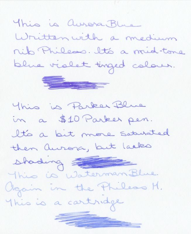
I am a confirmed ink lover and have a preference for BLUES that are either brilliant or deep in color.

In my blue collection I have:
Pelikan
Lamy
Namaiki
Parker Quink
Sheaffer Skript
Waterman
Levenger Cobalt Blue
and 6 different blues from Private Reserve.

In total in the bottle I have some 35 inks of a variety of colors and brands plus 3 bottles of "Sunoco Custom Blend" colors I did myself from the afore mentions bottles.

I do have some cartridges for those cartridge only pens, and those I tend to go with the same brand cartridge to the same brand pen mostly. One thing is there are a number of makers in the International Short Cartridge, which allows for greater choice with that size/shape.

My favorite Black is from Aurora in Italy. It came in 3rd in some test for blacks beat out by some hard to find Asian Black inks for fountain pen. Duke Black was #2, but I can't remember who was number one.

(Who does Number Two Work FOR?! Austin Powers)


I do have favorites in performance, the Namiki and the Lamy, then the Pelikan in Blue. I love the color of the PR: American Blue, Lake Placid Blue and the DC Super Show Blue (2005?) they are awesome.

PR Copper Burst and their Araibian Rose Red are very cool. And the Orange Crush too.

Remember people will cherish a handwritten note or letter, you rarely hear of a cherished email, so write somebody today!:eusa_clap
 

Miss Neecerie

I'll Lock Up
Messages
6,616
Location
The land of Sinatra, Hoboken
I am a bit more daring.

Currently have Private Reserve's Orange Crush in my Esterbrook. It's very halloween pumpkin without being neon orange like, so still very classy. The Esterbrook is copper, so you know what color ink is in the pen, just by looking!

I have Private Reserve's Chocolat in the Phileas, because the medium nib gives lots of color shading, and again, it's Autumn like.

I also really like Private Reserve's Sherwood Green and it will probably make it into a daily pen in time for Christmas.

I then use cartridges in the Cart pens, so black and blue in the Parkers I have.

I use J Herbin cartridges in my Rotring Core (ugly pen, but love how it writes). I currently have Rouge Opera(a red), Violete Pensee(bright violet), and Pouissere de Lune(dark eggplant like) for that.

I will probably buy more inks....its a constant battle not to....and I do need some waterproof Noodlers at some point.
 
Messages
11,579
Location
Covina, Califonia 91722
Herbin, Herb!

Miss Neecerie said:
Rotring Core (ugly pen, but love how it writes).

YES! I have 2, a fine and a bold point nib. They are like a modern sneaker the Air Jordan of the fountain pen world. Technically proficient and comfortable, but less graceful than a cantelever bridge.

How do you like the J Herbin inks? Good color?
 

Miss Neecerie

I'll Lock Up
Messages
6,616
Location
The land of Sinatra, Hoboken
John in Covina said:
Miss Neecerie said:
Rotring Core (ugly pen, but love how it writes).

YES! I have 2, a fine and a bold point nib. They are like a modern sneaker the Air Jordan of the fountain pen world. Technically proficient and comfortable, but less graceful than a cantelever bridge.

How do you like the J Herbin inks? Good color?

I paid 1.99 at a Big Lots for my Core....I wish I would have known how nice it wrote, I would have picked up 15 more.

The Herbin's (and i only have them in Cartridges, so milage on the bottled ones might be different) are lovely, not super saturated, so very old fashioned feeling. I havent used the Rouge Opera just yet, so not sure how bright that one is. But the other two are bright enough, but not so bright they can't be used in a business setting, for an unusual non blue.

You get the 'very old world, slightly faded' feeling from them, and I am quite sure that its intentional, and makes a nice change from all the super saturated colours.
 

Hemingway Jones

I'll Lock Up
Bartender
Messages
6,099
Location
Acton, Massachusetts
I was just thinking about this very subject. I have been using the Waterman blue, which is a very nice shade of blue, but I find it, at times and depending on the paper, to be a bit watery. bink said it is all due to the name: Waterman!

I am looking for an ink that is perhaps a little more consistent and perhaps more of a royal blue. I will let you know how my search goes and if you have any suggestions, I am certainly open to them.
 

Miss Neecerie

I'll Lock Up
Messages
6,616
Location
The land of Sinatra, Hoboken
Hemingway Jones said:
I was just thinking about this very subject. I have been using the Waterman blue, which is a very nice shade of blue, but I find it, at times and depending on the paper, to be a bit watery. bink said it is all due to the name: Waterman!

I am looking for an ink that is perhaps a little more consistent and perhaps more of a royal blue. I will let you know how my search goes and if you have any suggestions, I am certainly open to them.

Try Aurora Blue. I find it really lovely and dark and saturated. I will write something with it and scan it in later tonight, If that would be of some help.
 

Hemingway Jones

I'll Lock Up
Bartender
Messages
6,099
Location
Acton, Massachusetts
Miss Neecerie said:
Try Aurora Blue. I find it really lovely and dark and saturated. I will write something with it and scan it in later tonight, If that would be of some help.
That would be helpful, and I can check out your handwriting! (mine is evident on the pen thread!) Which company makes this ink?
 
Messages
11,579
Location
Covina, Califonia 91722
Pen Meeting this Saturday!

I listed this in the events so check it there for the info.

The Southern California Pen Collectors Club is meeting on Saturday (10/7/06)in MONROVIA east of Pasadena from NOON to 3pm (ISH). It is a great meeting usually you can see lots of stuff stuff and learn alot too.

It is at a private home. See details under events section.
 
Messages
11,579
Location
Covina, Califonia 91722
Aurora from Italy

Aurora is a Pen manufacturer in Italy, their Ipsilon model is one of the big sellers and they make gorgeous pens. Many pen manufacturers are also ink makers and it is thought they try to match their ink for use in their pens. Some are actualy formulating while others have a current ink maker bottle and label for them, perhaps customizing the colors a little for specific brand relationships.
 

moustache

Practically Family
Messages
863
Location
Vancouver,Wa
Love browns!!!

I usually enjoy browns in my pens.As of now i have 5 different browns.I use them in my Visconti's and my Signum's.The Conklins have blues and greens.I use Noodlers,Private reserve and Waterman as my main inks.
Here are a few shots.

My Visconti triplets!!
triplets7.jpg


My Signum Nova
3b_12.jpg


The Tryphon Clef
Clef_3.jpg


These are a few of the gems!!
Thanks for letting me share.

JD Ross
 

Lord Jagged

New in Town
Messages
46
Location
England
I've always been a big fan of writing and nice pens - right from my school days. I have a few really nice pens. My favourites are Watermans and my beloved Yard-O-Led. I have a collection of lovely Diamine inks and pick colours at random so my notebooks are always rather interesting.

viceroy_grand.jpg
 

Hemingway Jones

I'll Lock Up
Bartender
Messages
6,099
Location
Acton, Massachusetts
Well, judging by that, I prefer the Parker Blue. The Aurora looks inconsistent and the Waterman is all washed out.

Thanks for posting that. It's a good thing I have a laptop; it makes it easy to tip my computer to read it.
 

Miss Neecerie

I'll Lock Up
Messages
6,616
Location
The land of Sinatra, Hoboken
Hemingway Jones said:
Well, judging by that, I prefer the Parker Blue. The Aurora looks inconsistent and the Waterman is all washed out.

Thanks for posting that. It's a good thing I have a laptop; it makes it easy to tip my computer to read it.

The inconsistency is called shading, and its in general a desirable thing. More expressive and less automated.

You might also try Visconti blue.
 

Hemingway Jones

I'll Lock Up
Bartender
Messages
6,099
Location
Acton, Massachusetts
Miss Neecerie said:
The inconsistency is called shading, and its in general a desirable thing. More expressive and less automated.

You might also try Visconti blue.
No, I'm not speaking of that effect. I like shading, but look how the word "Aurora Blue" is nearly as washed out as the Waterman ink, especially by the time you get to "blue," and the "T" is very vivid initially:


In contrast, the Parker looks very vivid:


Does it look that way in front of you, or could it be a function of the pen?

I really appreciate the help with this, Neecerie.
 

Forum statistics

Threads
107,392
Messages
3,035,929
Members
52,814
Latest member
ThomW
Top