Want to buy or sell something? Check the classifieds
  • The Fedora Lounge is supported in part by commission earning affiliate links sitewide. Please support us by using them. You may learn more here.

Vintage Typefaces

Nobert

Practically Family
Messages
832
Location
In the Maine Woods
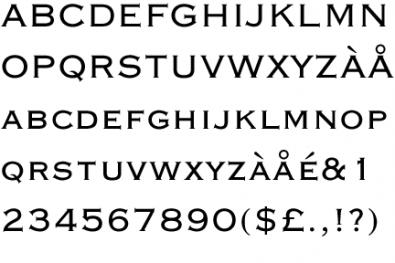
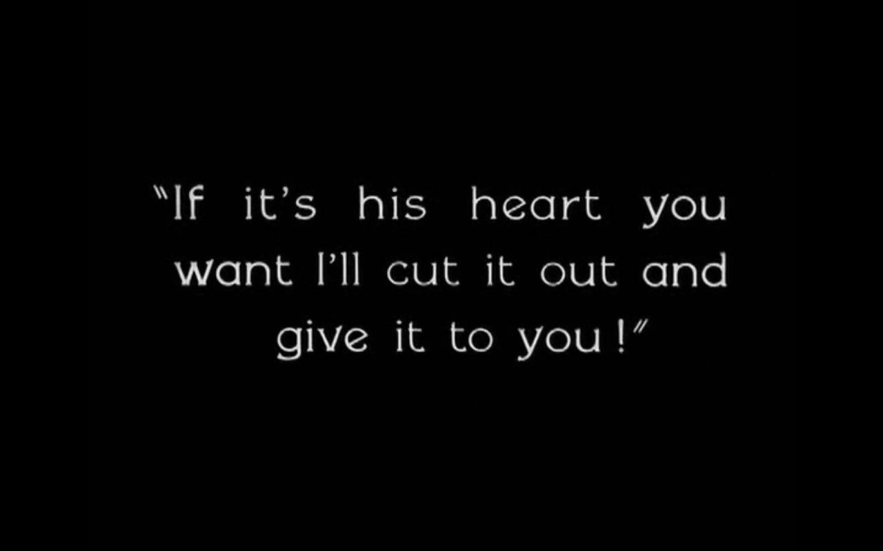
I’m hardly a senior member here, but I have yet to see a thread (either by search or in my several lurker years) devoted to the type and lettering styles that make up so much of the visual environment of that part of history that interests the all of us. So I thought this might be a useful resource to anyone who is interested in learning more about the graphic tropes of the early-to-mid 20th century, or a guide to anyone who wanted to recreate it for event flyers, reenactments and what-have-you.

I’m sure there are a number of Floungers who are graphic designers (or, to use the anachronism: commercial artists) to whom this will be old hat. But for the type tyros, I thought to post an overview of popular faces specific to several periods with a few examples, and see if it goes anywhere. In addition, I’ll invite any member who wishes to post an image containing a typeface that they are curious about; I will identify it if I can (and if I can’t, there are probably others whose expertise is greater than mine). Please post any of your own favorites, information, or links to sites that feature period type and design (that last is a bit self-serving, as I’ve lost some of my own bookmarks).

One final word about using typefaces, if you have any desire to recreate a vintage look for some personal or commercial project. There are, at last count, approximately three bajillion sites that offer “free fonts.” Some of them may be appear perfect replicas of popular or classic (and costly) faces. Most of these are rickety jobs in the field of type design, appropriate enough for a birthday card or a flyer, but not suitable for serious graphic design work. More to my point, some of them may be illegal. In the U.S., you can’t copyright a specific type design, but you can copyright the programming that creates the font file on your computer. Even the free versions you get are often licensed only for “personal” rather than “commercial” use (okay for scrapbooking or making a calendar, but not for a self-published novel that you plan to sell). Always check the EULA (End User License Agreement). If there isn’t one, be wary.
 

Nobert

Practically Family
Messages
832
Location
In the Maine Woods
Starting with the turn of the century:

Cheltenham
Introduced in 1905 by Bertram Goodhue—an architect by trade—this was an immediate success and became probably the most dominant display type until the nineteen forties or fifties. The typesetter’s watch-phrase for headlines during much of the “golden era” was, “When in doubt, use Chelt.” A robust face suitable for many printing applications it is most easily distinguished by the characteristic open lower bowl of the ‘g,’ which looks rather like the bottom half of the number five. Note, there is a version called “ITC Bk Cheltenham” that comes standard issue on many computers, this is not the quite the same. It’s been redesigned for better usage in long passages of small text. There are still poster versions available that better recreate the versions of yesteryear.
5m8rdilrs6gejq.jpg


Lining DeVinne or DeVinne No. 2
One of the most popular headline faces of early 20th century, if you spend any time looking at newspapers of the era you’ll probably see it. It contains a feature that is almost idiomatic to type and lettering of the Edwardian/Progressive period: the leg of the ‘R’ is a concave, tapering curve. Inspired several copies, including the still available Romana.
BBS-1907-DeVinneCompressed-small.jpg

Goudy Old Style
Frederick Goudy was one of the great type designers, and his longest-lived contribution, Goudy Old Style, is arguably the classiest typeface in existence. Released ca. 1915 (I think), it is still easily found, often used for high-toned literary purposes.
xlg_goudy_0.jpg

Century Old Style
Commissioned in the late 19th century for The Century magazine, this slightly condensed but sturdy type was popular for test usage. Century Schoolbook came later.
Century-magazine-300x311.jpg

Windsor/Souvenir Gothic
Both of these are Art Nouveau inspired faces that were used, both of them were also revived and even more widely used in the late 60s and 70s. As such, for people my age or older, that will be the first associations they have with these two distinctive types, somewhat tattered by overexposure. Ditto for Bookman.

Franklin Gothic/News Gothic
I lump these two together as they are both still widely used. Both are M.F. Benton designs, and inspired by Akzidens Grotesque (a.k.a. Standard, the basis for nearly all “grotesque” sans-serif faces, including one much beloved by designers that I won’t get into in here, but which rhymes with “Smellvetica”). These days they both come in a variety of weights, but if you want a more vintage look, use Franklin Gothic in heavy/bold weights and News Gothic in light weights. That’s the way they were originally designed.

Venus
A sans-serif that has not stayed with us, but is otherwise similar to the above, with a few eccentricities that I like.
(couldn't find a good image, I'll try to construct my next post more carefully).
 

Gingerella72

A-List Customer
Messages
428
Location
Nebraska, USA
The first thing that came to mind when I saw the Cheltenham was old children's books of the era. Is this what was used in the Dick and Jane books?
 

Doctor Strange

I'll Lock Up
Messages
5,228
Location
Hudson Valley, NY
I worked in a couple of NYC type shops in the late 70s/early 80s (and my sister worked in publishing), and Souvenir was indeed insanely overused back then! It briefly looked hip, but quickly became a cliche.
 

Nobert

Practically Family
Messages
832
Location
In the Maine Woods
The first thing that came to mind when I saw the Cheltenham was old children's books of the era. Is this what was used in the Dick and Jane books?

I looked up a couple of Dick and Jane images online, and the type in them looks to me like Century Schoolbook. The two are similar, fairly wide with strong color (that's type jargon for having a lot of black, relatively speaking), but Chelt is a bit blockier and the Century family a bit more refined.

airplane2x.jpg

Taking a closer look myself, the text in that ad may be something else, hard to tell at that size. But "Fire Extinguishers" and "Pyrene Saved Jonn's Bride" are definitely Cheltenham.
 
Last edited:

Nobert

Practically Family
Messages
832
Location
In the Maine Woods
I worked in a couple of NYC type shops in the late 70s/early 80s (and my sister worked in publishing), and Souvenir was indeed insanely overused back then! It briefly looked hip, but quickly became a cliche.

Yeah, I was trying to find a good image from U&lc or some such to demonstrate this, but I couldn't some across a good example.
 

Nobert

Practically Family
Messages
832
Location
In the Maine Woods
So, on second thought, rather than doing a chronological typeface overview, I figured it would work better if I just found interesting images and went from there.

Entering the "modern" era, we have this poster by Lucien Bernhard, one of the founders of said modernism. The wobbly-edged letters are typical of his approach, and can be seen on Bernhard Antique, one of dozens of faces he designed. "Problem" by the way, is the actual brand of the cigarette advertised, it's not an early antismoking campaign.

02.jpg

By the 20s, a fellow by the name of Jan Tschichold developed what he called the "Neue Typographie," going hand-in-glove with the dynamic, motion driven design movements that were at the forefront of European design at the time, such as Futurism. It featured an asymetrical approach, slanted type and a mishmash of sizes that were meant to express the spirit of the faster-moving machine age.

32234.jpg

These trends were also, of course, embraced by the Bauhaus.

08.jpg
 
Last edited:

Nobert

Practically Family
Messages
832
Location
In the Maine Woods
Nice thread!

The Economist had a recent article about the once-lost "Doves" typeface:

http://www.economist.com/news/christmas-specials/21591793-legendary-typeface-gets-second-life-fight-over-doves

Tony

Nice article.

20131221_DTP501.jpg

This is a good example of a Venetian style typeface--a mode dating from the 15th century and one of type's first great flowerings--that is very late medieval/early-renaissance in look. As the article notes, this was a something that was seized upon by the Arts and Crafts movement, and remained in vogue throughout the Edwardian period. Faces such as Kelmscott and Centaur came out of this, as well as another contribution by Frederick Goudy: Berkely. A version of Berkely called Californian comes as standard packaging on most PC's. A good indication of Venetian lettering is the slanted crossbar on the 'e' which was a popular motif that extended into the 20s.
 

Nobert

Practically Family
Messages
832
Location
In the Maine Woods
The variable nameplates of Vogue

For today's highlight in "Lettering Styles of Yore," I thought I would look at the phenomenon of the changeable nameplate. The nameplate, or flag, is the title of a publication that appears on the front page or cover, usually in a distinct logotype that helps identify it. Some publications have departed from this tradition, altering the nameplate on an occasional (as in the old Life) or frequent basis to fit the style of the cover. Probably no magazine did this more than that bastion of women's fashion, Vogue.

Vogue's editors seem, during the 20s and 30s, to have given their cover artists free rein in designing their own titles to fit the aesthetic of their image. Often, a typically art-deco style of lettering was used, but just as often the lettering could get downright fanciful.

This is something virtually unheard of in modern graphic design, which is almost totally circumscribed by theories about the importance of "branding," and a seeming presupposition that their viewership is functionally illiterate.

But here are some of the products of commercial artists' imaginations from the period:

leemillervogue.jpg

vintage_vogue_cover_1926_jul.jpg

VoguecoverJul1926_XL_320x421.jpg

Vouge+1937+-+dog.jpg

VoguecoverOct35_XL_320x421.jpg

This is one of my favorites, just because I have a copy of the magazine.

Voguecover_Oct24_XL_320x421.jpg

And one of the most original:

lisa-fonssagrives-photographed-by-horst-p-horst-1940-vogue-cover.jpg
 
Last edited:

Nobert

Practically Family
Messages
832
Location
In the Maine Woods
Newspaper Column Heads

In the days when newspapers were printed in black and white, and the grind of putting out a complete chronicle of the day's events, every day, typography was often a matter of practicality rather than nicety. One area in which a bit of decorative flair could be used to add some variety was the use of 'standing material,' the headings that were used for specific sections, such as the sports or society pages, and for the columnists--local or syndicated, usually op-ed--that regularly appeared on scheduled days of the week. These could be composed beforehand and inserted where they were needed. In the early days of big news (roughly the 1870s onward) these headings could be quite ornate and illustrative, or purely typographical. This hand-lettered example is from 1909.

philadelphia-inquirer-newspaper-0924-1909-food-column.jpg

As time went on, more simple, typographical approaches were used. The column headings of today are often in the paper's headline type, with perhaps a picture of the columnist. But as often as not, they once served as miniature banners for the musings of writers that readers expected to see.

Newspaper_UpAndDownBroadwayWithWalterWinchell.jpg column-crop.jpg fair enough.jpg


In all probability, these headings were left up to the individual paper's makeup department, as the same column often appears in different styles.

myday_pic.jpg seattle-daily-times-newspaper-0221-1936-eleanor-roosevelt.jpg


This tradition continued at least into the 60s, (and may be still in use today, in some places).

Dear Abby.jpg

Especially for some of the splashier papers, like the New York Evening Graphic.

sullivan&winchell.jpg

If anybody knows of any other examples of these decorative standing heads, I'd love to see them.
 

Nobert

Practically Family
Messages
832
Location
In the Maine Woods
Copperplate Gothic is quite distinguished when used correctly, usually as a way of transmitting a feeling of civic import, such as for banks, law firms, or railroads.

I'm afraid I don't think much of that fellow's blog. His bio says that he grew up in Puerto Rico, so I'm willing to give his deplorable grammar the benefit of the doubt as English may not be his first language. But he's also a sloppy researcher. He credits one "Frederic Williams" as creating the typeface around 1905, when it was in fact designed by Frederic Goudy (again) and according to all other sources, released by American Type Founders in 1901 (his entry on Gill Sans is also rather fuzzy).

Art Gothic Is one of my favorites that shares some of the attributes that give Copperplate its turn-of-the-century Americana feel, but is considerably more Art Nouveau in its letterforms. I have a book from the late 19th century with chapter headings in a nearly identical face (it was also used in the opening titles of Murder, She Wrote).
 
Last edited:

LizzieMaine

Bartender
Messages
33,074
Location
Where The Tourists Meet The Sea
One of the most familiar typefaces from the late teens thru the early thirties --

tumblr_m2bd2i4n5q1qfppz2o1_1280.jpg


Pastel, from the American Type Foundry. By the mid-twenties, the definitive typeface for movie intertitle cards, and still used occasionally as late as the early forties.
 

LizzieMaine

Bartender
Messages
33,074
Location
Where The Tourists Meet The Sea
Thanks, Lizzie, I've never actually known the name of that one, and it's been bothering me a little bit for years.

There's a modern knockoff version called "Silentina" which shows up on those 1001 Free Fonts type of websites -- it's close, but not identical to the real thing. They used "Silentina" in the recent film "The Artist" because they didn't want to pay for Pastel. Shame on them.
 

Nobert

Practically Family
Messages
832
Location
In the Maine Woods
May I just say, TM, you're really giving me impetus to keep this thread going. Thanks.

So, Lucien Bernhard. I mentioned him before, but really, what a guy. Think about your idea of was makes something, visually speaking, "modern." Chances are you're thinking of something bold, probably geometric, streamlined, minimal. In terms of graphic design, this has been what modern is since the late 'teens. Among the earliest inklings of this movement came out of Germany, and the person who really kicked it off, more than anyone, was Lucien Bernhard.

That being said, Bernhard's motives were essentially decorative. I'm not saying that's a bad thing, it's just a different goal than what many others in the applied arts, such as the Bauhaus, were going for, which was to change design on a fundamental level that would affect society. Not that I'm saying that's a good thing.

What I'm getting at is that Bernhard Fashion (1929) a very art deco face that uses a lot of geometric elements ('O' is a circle, many of the letters look to be drawn with compass and ruler), but also relies on more organic, hand-drawn forms ('a,' 'd',' 'g' etc.). It also has a lot of character and eccentricity to its letterforms, which is typical of display lettering of the 20's. It's a different approach than that of, say Futura, which is also based on geometric forms, but was trying to create a whole new approach to sans-serif type that represented a new, 20th century way of thinking. Bernhard, in the end, was just trying to make a good looking type for a specific purpose.

As the name implies, this kind of very thin, deco, geometric type was used a lot for fashion and style displays. By the 1980s, many of these type styles had become more associated with neon signage for things like shopping mall hair salons. I don't know about any of you, but this was something I had to overcome when I first got interested in the whole art deco era. Just as, when I first heard New Orleans jazz, the only think I could think of was a bunch of aged white guys in matching striped shirts with sleeve garters. Personal associations play a huge part in aesthetics.
 

Nobert

Practically Family
Messages
832
Location
In the Maine Woods
Going back a few posts, I came across this site, "Son of Typecasting," in which a professional designer discusses the use of type in various movies and T.V. shows, focusing especially on period inaccuracies. I like this blog, because the author admits readily that these are not the most glaring or important things necessary to making a movie good or bad, or even convincing. He notices them, the same way folks here would probably look askance at a 1940s suit in a film that takes place in 1912. In the above link, he discusses The Artist, the movie LizzieMaine referenced above. Because this is the FLounge, I also provide a link to the typographical anachronisms in the Indiana Jones series. Enjoy.
 

Forum statistics

Threads
107,316
Messages
3,033,881
Members
52,770
Latest member
green_entrails
Top