Want to buy or sell something? Check the classifieds
  • The Fedora Lounge is supported in part by commission earning affiliate links sitewide. Please support us by using them. You may learn more here.

Putting it all together

Flat Foot Floey

My Mail is Forwarded Here
Messages
3,220
Location
Germany
Bump because I like this thread.
Matt Deckard did write about the topic in his blog
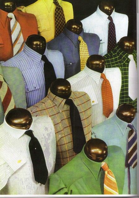
Matching checkered shirts could also be discussed here (I prefer stripes though)
 

herringbonekid

I'll Lock Up
Messages
6,016
Location
East Sussex, England
Adolphe Menjou in a very matching shirt and tie:


Matchingshirttie.jpg


Simpsons shirts and ties, circa 1938:


simpsonsShirts1938.jpg
 

Patrick Hall

Practically Family
Messages
541
Location
Houston, TX
Simpsons shirts and ties, circa 1938:


simpsonsShirts1938.jpg

Wow. A few of these I like. Some of them I don't like at all! Is that an Oregon Ducks themed look on the second row far right, with the white/silver tie over the mustard yellow on green windowpane? Looks about as bad as their post-Nike uniforms do. Also - it is interesting that so few of these seem to follow the wisdom i always hear - which is that a secondary color in the tie should pick up a color in the shirt.
 

herringbonekid

I'll Lock Up
Messages
6,016
Location
East Sussex, England
Does somebody know where this pictures come from? Or which time frame?

no, but the illustrations look post 70s. generally i agree with the advice. it's pretty much the same thinking that Alan Flusser covers in 'Dressing the Man' and is virtually gospel by now;

don't put patterns together that are too similar in tone and scale.

here endeth the first lesson.
 

Flat Foot Floey

My Mail is Forwarded Here
Messages
3,220
Location
Germany
Thanks.


Yes, that's the lesson. And if one pattern is too busy you need a plain fabric nearby to calm it down. But I still can't get used to big houndstooth. My brain hurts when I see it. Yes, I know. Cary Grant and all but still...
 

Deafjeff

Familiar Face
Messages
52
Location
Massachusetts
I'm glad this thread got bumped as I've used it in the past. I generally wear tattersall shirts and V Neck Sweaters with my tweed jacket and find that it seems to offer the right balance. I once wore a tie that was somewhat similar in color and design to a tattersall shirt I have and was told it didn't look right. I learned from my mistake and later wore the shirt again with a regular tie and was told that it looked great. Trial and error will teach you about what looks good together and what doesn't more than anything else
 

Deafjeff

Familiar Face
Messages
52
Location
Massachusetts
Today I actually saw an aquaintance of mine wearing a sportcoat....but it was a red one which he wore with a red T Shirt underneath. he was also wearing jeans and sneakers and I can't say I thought it was well put together. The diffrent reds caused a clash and I dislike the jeans with sportcoat look personally(Although I have seen people who do it well) so I didn't think much of how he was put together.
 

Patrick Hall

Practically Family
Messages
541
Location
Houston, TX
It's like a trousered version of pegged jeans. The late 20's must have been a really layered, complex time for haberdashery. Always discovering new surprises from that timeframe - like the ongoing thread in the General section about 20's-does-70's or 70's-does-20's...or whatever
 

Flat Foot Floey

My Mail is Forwarded Here
Messages
3,220
Location
Germany
I think it is rather ugly and would certainly look bad on me. I have larger hips. Maybe the slimmer folks cann pull this off. The peg+ turn up also reminds me of zoot suit trousers.

tumblr_lvkhkqzhMG1r7167qo1_500.png
 

herringbonekid

I'll Lock Up
Messages
6,016
Location
East Sussex, England
for me, the look has bad associations with the mid 80s. plus, i don't think distorting the natural shape of the body is wise in any extreme.
but i think that cat on the left -above- looks cool.
 

Two Types

I'll Lock Up
Messages
5,456
Location
London, UK
for me, the look has bad associations with the mid 80s. plus, i don't think distorting the natural shape of the body is wise in any extreme.
but i think that cat on the left -above- looks cool.

I love his knitted tie. It's a style that is thankfully still around. As for the late 20s trousers with the deep turn-ups: I'm not a fan. I like my trousers to hide my socks. Those turn-ups always look like they've been done simply to keep trousers out of the mud.
 
I never quite agreed with that wisdom. Contrast is a great thing. I really love the boldness of these shirt and tie combinations. I have been actively looking for several of these fabrics in the swatch books of Jantzen Tailors, in my recent shirt reproduction/buying adventure.

Incidentally the text that accompanies this image, on the next page of the Autumn 1938 number of Simpson's Magazine for Men states, when talking about the shirts section of the shop: "Here are such fabrics, such colours and patterns as you will not find together in any other single shop in London". I guess they were using the advert to illustrate this range of colours and patterns.

Also - it is interesting that so few of these seem to follow the wisdom i always hear - which is that a secondary color in the tie should pick up a color in the shirt.

simpsonsShirts1938.jpg
 

Flat Foot Floey

My Mail is Forwarded Here
Messages
3,220
Location
Germany
I just found it on tumblr but I know it is also in "one hundred years of menswear" by Cally Blackman. Very nice book btw.
 

Forum statistics

Threads
107,488
Messages
3,038,017
Members
52,883
Latest member
ALittleBitOfCompany
Top