Want to buy or sell something? Check the classifieds
  • The Fedora Lounge is supported in part by commission earning affiliate links sitewide. Please support us by using them. You may learn more here.

Putting it all together

Matt Deckard

Man of Action
Messages
10,045
Location
A devout capitalist in Los Angeles CA.
1006765460_l.jpg


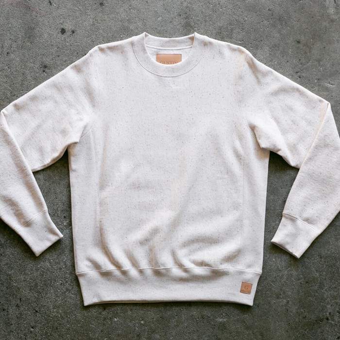
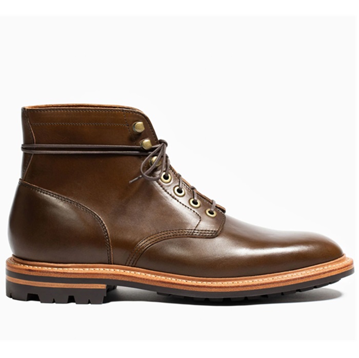
There is a logistical sense when getting dressed. there are patterns that work together and ones that do not.

Believe it or not, plaids and stripes do work together. In the next few posts I'm going to show you examples of balance in color and pattern matching.
 

Wild Root

Gone Home
Messages
5,532
Location
Monrovia California.
Yes I agree with Matt. There is a pattern and it will surprise you what works with what.

I'll be keeping my eye on this thread to see what Matt comes up with.

Root.
 

Wild Root

Gone Home
Messages
5,532
Location
Monrovia California.
cl_hwclc1.jpg


This is an old lobby card of a Carole Landis film I noticed that the guy on the right is wearing a yellow and brown tie with a blue suit! Most today don't consider blue and brown a good match. I think it looks good if done right.

Root
 

Wild Root

Gone Home
Messages
5,532
Location
Monrovia California.
Uh no Matt.. Not hand panted! Who told you that? Dressing the Man? They had color printers back then. Do you think they had a guy painting every card for every theatre? hahahaaha, That's a hot one! They wore colors like that all the time! Even if it were hand painted, the artist would be told the colors to use. You must remember that today's taste is WAY DIFFERENT then 50 to 60 years ago! Different times and types of color combos. Trust me! I know what I'm talking about. I've done my home work.

Root.
 

Matt Deckard

Man of Action
Messages
10,045
Location
A devout capitalist in Los Angeles CA.
No offense Root.

Just looks too cartoony to me. The colors are very Batman if you know what I mean.

I know it's a print. It's just surreal with the colored in faces and the ultra bright artificial look from paints. I have seen the yellow green and bright blues before, I just think there are better exampes of pattern and color mixing for suits.
 

Wild Root

Gone Home
Messages
5,532
Location
Monrovia California.
Well yes the colors are a little fake looking in some respects, but I have suits, ties, and have seen hats that match those colors spot on! The prints back then weren't as high quality as ours today yes, but they’re not to far off of what was really used in the studios.

No, it might not be the best example, but it still illustrates that they used different color combos back then! I would like to see some of your examples Matt when you get the chance.

Root.
 

jitterbugdoll

Call Me a Cab
Messages
2,042
Location
Soon to be not-so-sunny Boston
There is a great book called "Dressing the Man" that explains proper pattern combinations. It has great pictures (some excellent ones of Cary Grant, Tyrone Power and Fred Astaire) showing the fashionable looks of yesterday—it’s true that you can wear a patterned tie, shirt and suit without looking like a walking fashion faux pas! Interestingly enough, fashion of the 1930s-40s did combine lots of colors we normally don’t think of pairing today (men were a lot bolder, I think.) In fact, menswear companies actually advertised/published brochures that helped a man pick out the colors and patterns that would make him look his best. One of the keys to looking sharp is actually choosing the right colors and intensities for your skin tone. The book has some great photos showing how just a simple switch in tone can change a person’s entire look (and I think that's something a lot of guys don't really think about, at least in today’s jeans and t-shirts society!)
 

Bogie1943

Practically Family
Messages
672
Location
Proctorville, Ohio
Cheers...

Cheers goes out to you Matt, I find myself sometimes struggling with this sort of thing. Does that go with that, would this work with that. Always trying to get the best vintage looks out of all the things I have. I am happy that you are going to help people like me out, good stuff. I look forward to the lessons. Cheers Mate!
 

The Wingnut

One Too Many
Messages
1,711
Location
.
I think the point that Matt is making is that the lobby card is lithographed from a paste-up that uses a hand-tinted black and white photo. You'll notice in that in key areas the colors bleed over where they shouldn't. The yellow & brown tie is bleeding into the shirt just to the right of the knot. The red tie is bleeding over into the shirt to the right of its body, and what I'd assume in reality would be white polka dots on said tie are actually pink in the photo. Carole's hair is...yellow, not blonde. The gentleman on the right has an area where the tone of his hand blends into the blue of his suit. He's also either got a case of pinkeye or the artist let the tint go a bit into the corner of his right eye. There's excessive saturation of color in the shadows, areas that should have deeper contrast into the black range. Look at the gentleman on the left - his left(not our left) shoulder area shows this to an excess. It's the same principle as colorizing a black-and-white film, the color is laid over the original image, creating a somewhat oversaturated appearance.

The key giveaway is that the background is one solid, consistent tone, a sepia. It's not a canvas backdrop, it has depth of field and objects cast shadows consistent with the rest of the image. The artist didn't take the time - understandably - to tint the entire image, just the key elements. The heavily saturated, bright colors are to grab the attention of those viewing it....which you'd want in a flashy lobby card.

I'd still say it's quite possible that yeah, the tie was brown & yellow...and doesn't look half bad.
 

Cabinetman

A-List Customer
Messages
331
Location
Central Illinois
Matt, you've struck a chord with me, and oh, what beautiful music it is. Now that is looking very sharp.

So pleased you started this discussion. Good guidelines for me to shop by.
 

MKL

A-List Customer
Messages
316
Location
Kansas
The scans

Thanks Matt, for the scans. They will look good on my screensaver.

MKL
 

Wild Root

Gone Home
Messages
5,532
Location
Monrovia California.
Now, that's what I'm talking about!!! Good deal bud!

I have worn brown shoes with 90% of my suits and people have told me that you don't wear browns shoes with a dark blue or gray suit. I laughed and said, yes you can! I have seen it meny times over and over! If you wear black shoes with dark colors, it makes the whole suit dressier.

Brown is a way to dress things down with out wearing sweat pants and T-shirts.

Keep them coming bud!

Root.
 

Matt Deckard

Man of Action
Messages
10,045
Location
A devout capitalist in Los Angeles CA.
Those original scans most are out of an Esquire book and were put on the net by a man named Ed Tutee. I have the same book.

Some scans from my mags and Sears catalog still to come.

Right now I'm getting ready to take some actual photographs of people wearing clothes that are well coordinated.

Socks: You should have them work in concert with the color of the pants. I'll show you what I mean.

Hats: You can match you hat to your belt and shoes, though if the color is too harsh a departure from the rest of your outfit (black hat with black ribbon, light brown suit, black shoes) you might look like you have on bookends. You can mix the hat and the shoe colors.
 

Mycroft

One Too Many
Messages
1,993
Location
Florida, U.S.A. for now
I know this might be erelevent (forgive the spelling), but it has to do with matching , but did people in the Golden Era have matching assesories (like cufflinks, money clips, cigarrete cases etc.)? Also, did they have a different set of assesories for a different suit, such as with a blue suit having a gold cigarrete case, and a diffeent color for a grey suit or they just carred and had one of each assesory?
 

Matt Deckard

Man of Action
Messages
10,045
Location
A devout capitalist in Los Angeles CA.
I agree in regard to the belts.

This is all up to interpretations so as example are given with my own pics you will get to know my taste better, and tase should always vary between inividuals.

I like to follow the old Hollywood style set in the 30's with my own salting here and there.

Most men nowadays are given the Allen Flusser treatment when it comes to styling, and if you don't have a trim figure you're out of luck with the look. It is more of the Gordon Gecko look from Wall Street. Lower waisted trousers with suspenders and the suit that turns you into a triangle.

The Hollywood style is a fitted jacket and full cut pants which drape. even the heavier set fellas look better in the vintage cuts from 30's than the bagged up modern cuts carried over from the 70's.

With a Khaki suit like the one in the first pic I'd definately try to match the belt with the shoes. Maybe even wear dirty bucks (tan) and a cotton belt with a brass buckle or a rougher looking belt to go with the casual look of the suits rumpled style.

Joseph C. Brandstetter
 

Forum statistics

Threads
107,031
Messages
3,026,754
Members
52,533
Latest member
RacerJ
Top