Want to buy or sell something? Check the classifieds
  • The Fedora Lounge is supported in part by commission earning affiliate links sitewide. Please support us by using them. You may learn more here.

1920s apothecary opening-- design help needed

KenCarsonCowgirl

New in Town
Messages
22
Location
The Heart of the West
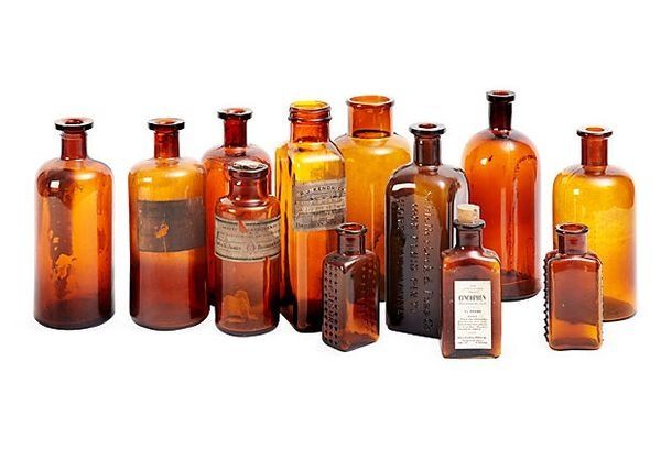
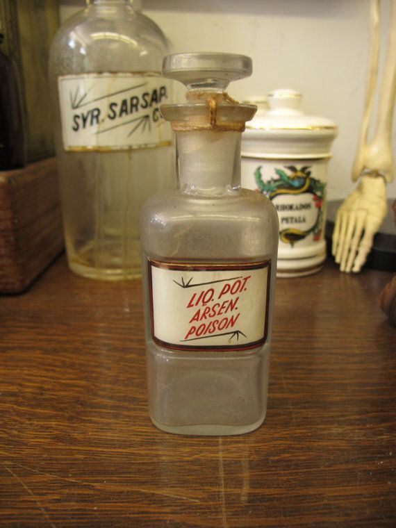
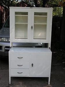
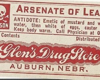
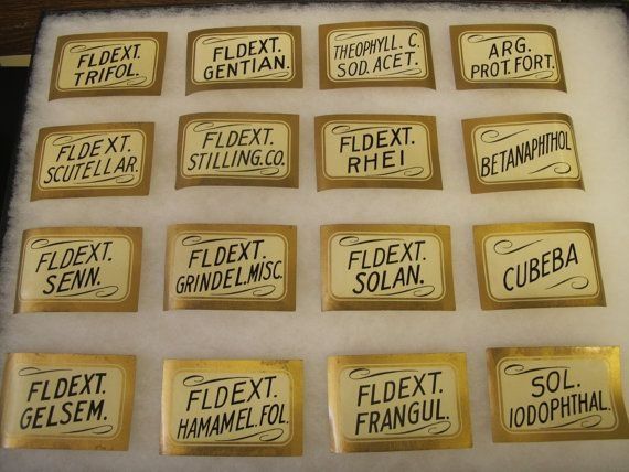
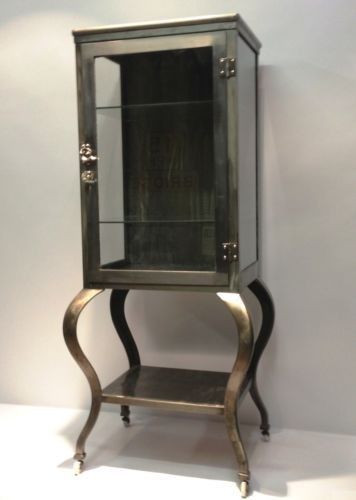
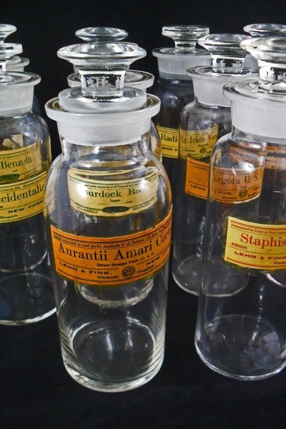
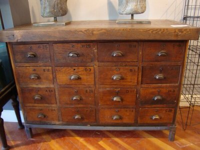
I was given the responsibility of designing a sign/logo and website (complete with style and color scheme) in the style of a 1920s pharmacy/apothecary for a store that is potentially opening next year (which will be era-correct as well). So, I need your help. What colors were in vogue back then for businesses? Red and white is more of a later retro vibe....maybe teal and cream?

I must admit to being more versed in 1940s styles than 20s. So I turn to the experts here for help. Any and all suggestions (and website inspiration) very much welcome!
 

LizzieMaine

Bartender
Messages
33,061
Location
Where The Tourists Meet The Sea
We had an intact '20s-era drugstore in my town when I was growing up -- it had a lot of dark, varnished woodwork, white tiled walls and a floor made up of small black and white tiles. It was *NOT* that cliche-of-retroness black and white checkerboard tiles, but rather more of a mosaic pattern made up of small hexagons. The idea was to promote a medical style of antiseptic cleanliness.

The white walls had a yellowish cast, but I suspect that might have been tobacco smoke deposits from people smoking at the fountain/lunch counter.

Chain drugstores had their own color schemes. If you saw orange and blue everywhere, you knew you were in a Rexall.
 

scotrace

Head Bartender
Staff member
Messages
14,376
Location
Small Town Ohio, USA
Why teal and cream?

I'm thinking red and white, black and white, bottle brown. Glass.

a7613f366b7aa68eaee9460e752f95c1.jpg


6d84215a5248b0e06d498ef8db61a360.jpg


72969e8412063746bd10ed64efa43e29.jpg


9ec88e4893c193940f9935b163a157db.jpg


8eb2d03180c585e604c884bba175e10e.jpg


044796992b3405b04db78c6113c25e5a.jpg


db929745ec1d26926ad633e568251f3c.jpg


eb20f5ed07cba59cce4e7f142ed28901.jpg
 

Attachments

  • image.jpg
    image.jpg
    100.1 KB · Views: 269

KenCarsonCowgirl

New in Town
Messages
22
Location
The Heart of the West
This is great. Thank you, all! I decided on a dark red/navy/mustard, sort of a rich color scheme, after researching the period. We'll see what comes of it. Maybe I'll be posting about the apothecary's grand opening in a year! :D
 

cookie

I'll Lock Up
Messages
5,927
Location
Sydney Australia
We had an intact '20s-era drugstore in my town when I was growing up -- it had a lot of dark, varnished woodwork, white tiled walls and a floor made up of small black and white tiles. It was *NOT* that cliche-of-retroness black and white checkerboard tiles, but rather more of a mosaic pattern made up of small hexagons. The idea was to promote a medical style of antiseptic cleanliness.

The white walls had a yellowish cast, but I suspect that might have been tobacco smoke deposits from people smoking at the fountain/lunch counter.

Chain drugstores had their own color schemes. If you saw orange and blue everywhere, you knew you were in a Rexall.

Lizzie that style of tile was very popular in bathrooms in 1920s Aussie California Bungalows...the basic 1920s-30s Aussie suburban home. They were often offset with a Greek key border. See below:

http://www.belmondotiles.com.au/sys...ek-Key-Border-with-extra-strip.gif?1320024224
 

Forum statistics

Threads
107,278
Messages
3,032,905
Members
52,748
Latest member
R_P_Meldner
Top