TheDane
Call Me a Cab
- Messages
- 2,670
- Location
- Copenhagen, Denmark
PS: When it comes to felt/ribbon combos, Rabbit has made some outstanding comparisons. Have a dig - and have a deep one! (Rabbit, you are a pearl!) ")

While it's hard to define what medium grey is, lighting plays a big factor.
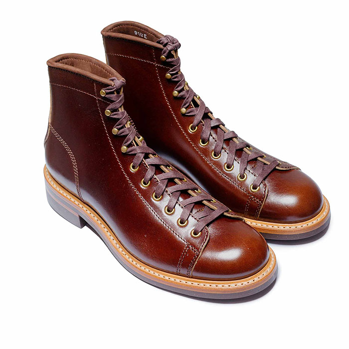 John Lofgren Monkey Boots Shinki Horsebuttt - $1,136 The classic monkey boot silhouette in an incredibly rich Shinki russet horse leather.
 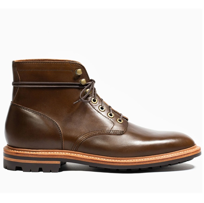 Grant Stone Diesel Boot Dark Olive Chromexcel - $395 Goodyear welted, Horween Chromexcel, classic good looks.
 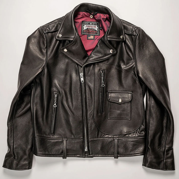 Schott 568 Vandals Jacket - $1,250 The classic Perfecto motorcycle jacket, in a very special limited-edition Schott double rider style.


I can get a side-by-side photo up over the weekend...Blue Smoke is a pastel like color to me where Moonstone is an earthy medium grey, one of the most versatile shades out there.


During my career as sound engineer I used to teach musicians and fellow technicians "spectral hearing" - the ability to evaluate differences in energy levels between 10 to 30 areas/bands within the human audible range. The "tool" is used in filtering/equalization, and the goal is to bring the person beyond expressions like "harsh", "fluffy", "*****" (as in: Played through a horn shaped structure), "boxy", etc. Instead you'll be able to determine "to much 500 Hz" or "too little 2 KHz" and quantify exactly how much. The goal is: "Evaluate - decide - and THEN correct by adjusting the correct buttons the correct amount". No trial and error - no guessing or fiddling around with buttons.Language is unfortunately very limiting here.
No problemo....at least you get same lighting & same camera aspects...colors are hard with various monitors as well....Thank you for that comparison Dean. It helps a Whole lot!!