LizzieMaine
Bartender
- Messages
- 35,507
- Location
- Where The Tourists Meet The Sea
I woke up this morning with a dark brown taste in my mouth. Bleah.
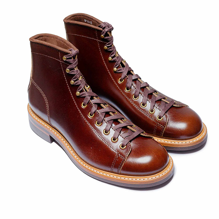
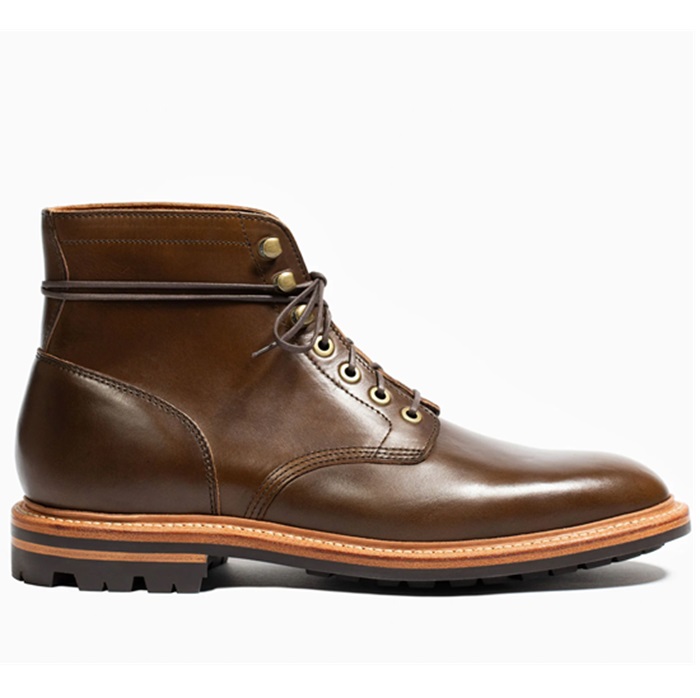
Brown is a good color for shoes, though. And I do like dark brown varnished woodwork. And even the St. Louis Browns. But brown walls would make me feel like I was living inside a Hershey bar.
Brown is a good color for shoes, though. And I do like dark brown varnished woodwork. And even the St. Louis Browns. But brown walls would make me feel like I was living inside a Hershey bar.