Paisley
I'll Lock Up
- Messages
- 5,438
- Location
- Indianapolis
Did the colors change again? The stickies look more reddish-brown now. I like it.
Did the colors change again? The stickies look more reddish-brown now. I like it.
While perusing the Members List I noticed the absence of one Marc Chevalier. That's akin to the NBA record books making no mention of Michael Jordan. Just an observation; I assume it's a tech gremlin at work.
Thanks for replying. Security holes? What security issues were there?
Although Id been a big advocate of black text on light background, after reading the forum that way for a couple of days, I have decided that it doesnt look like The Fedora Lounge, so I am back to blackend. I just wish the letters in the posts were the same shade as those in the signatures - not completely white (that was too jarring for me and was the original reason for my desire for black on white), but not as gray as they are currently.
Unfortunately I have to leave various cookies from certain financial institutions in the cache or I'll be locked out of the accounts and have to talk to bankers for half a day to reopen them.Have you tried deleting the cookies in Firefox?

I tried setting the message color exactly the same as the Signatures, and that was tremendously jarring to the eyes (and I asked several folks for independent opinions on it). Still, at the time I write this it is 40% lighter than it was at the time you wrote your message. A good bit lighter, but not so much as to be terrible looking. For those who want to have stark white text on a plain black background, I'll try to find a style that does that.
Unfortunately I have to leave various cookies from certain financial institutions in the cache or I'll be locked out of the accounts and have to talk to bankers for half a day to reopen them.
That said, I just successfully logged in on Firefox. :eusa_clap
Is there any chance of the tag being allowed in signatures?[/...od at the end of your link in your signature.
It already is allowed-- You have a period at the end of your link in your signature.
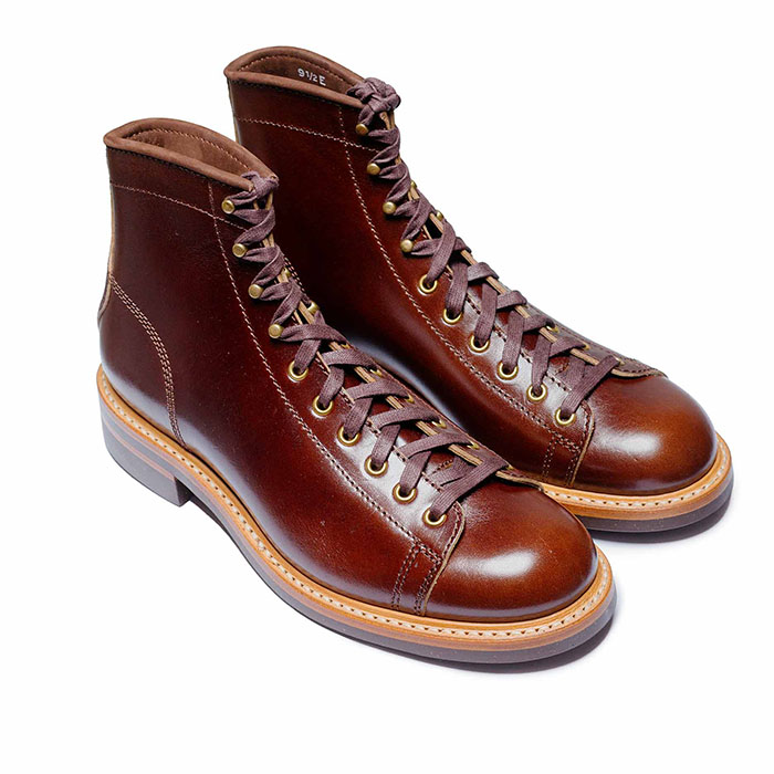 John Lofgren Monkey Boots Shinki Horsebuttt - $1,136 The classic monkey boot silhouette in an incredibly rich Shinki russet horse leather.
 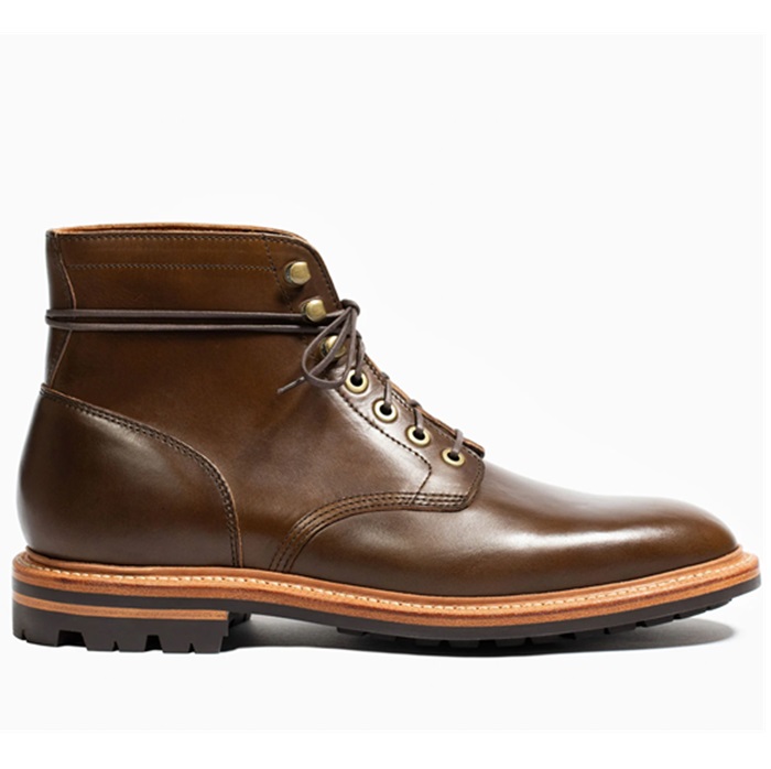 Grant Stone Diesel Boot Dark Olive Chromexcel - $395 Goodyear welted, Horween Chromexcel, classic good looks.
 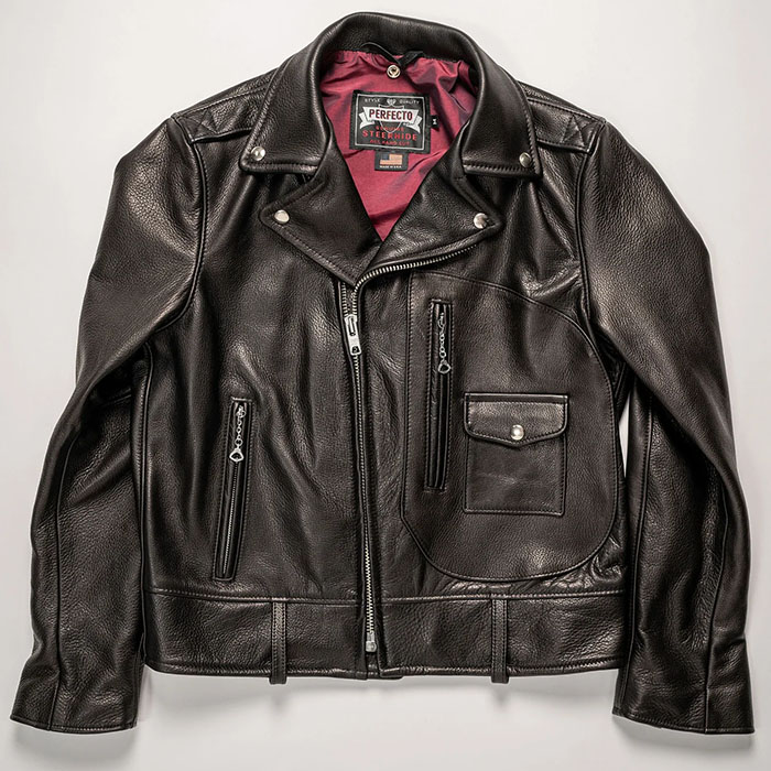 Schott 568 Vandals Jacket - $1,250 The classic Perfecto motorcycle jacket, in a very special limited-edition Schott double rider style.
 1. What browser are you running? The editing window color should be white by default. If it's not, you can click the button on the top right above the editing window that looks like it has a small, black letter 'A' and a larger blue letter 'A', and that will change the color of the editing window from black to white.
2. What browser/OS are you running?
3. As I have said earlier in this thread, many of the icons need to change. Especially the post icons and the smileys.
4. I'll check on the deal with the image resizing.
5. Re: the message count glitch, what resolution are you running? This stylesheet isn't set to a fixed width, so some things will compress if you're running a really low resolution display.
6. Thanks for your support.
Unfortunately I have to leave various cookies from certain financial institutions in the cache or I'll be locked out of the accounts and have to talk to bankers for half a day to reopen them.
That said, I just successfully logged in on Firefox. :eusa_clap
The thread URLs are now different after the upgrade, and it will take a while for googlebot to reindex our pages. It's actually doing it now, so expect googling things to not work exactly right for the time being. Our in-house search has been vastly improved, though...


 Ah, the humors of CSS. The problem is that the image doesn't get downsized to the maximum possible resolution that would fit in the container but to a fixed horizontal resolution of 640 px.
A little update to my previous post:
The glitch in the postcount display only starts to occur if the first number exceeds one figure, eg. Results 1 to 10 of 26847 gets displayed correctly while Results 11 to 20 of 26847 ends up garbled.
Good:
Bad:
As soon as the first number exceeds two figures the blue navigation button on the far right ends up displaced as well.
BTW: The glitch disappears if I turn off my favorites - which I don't really like... I'm running my computer at a resolution of 1600x1280, which should be plenty.
Lest I forget: The image resizing 'glitch' still persists. For example, the image above doesn't get displayed at the original resolution... I figure that image resolutions are simply no longer allowed to exceed the spatial resolution of that gray frame containing a single post, which would make it a 'feature' and not a bug...
Another strange thing I noticed is that in the main menu there are numerous backslahses (\) displayed in the description, usually where apostrophes or quotation marks appear in the text.
Note the backslash between doesn and 't in the screencap:
:eusa_clapImpressive work all-around. I would add an applause emoticon but I can't find them. (I would add a shrug....) Now, I'm starting to get silly. Where IS that laughing emo' and...?
Also, when I do see that other more clever people have made use of the little faces, those new style emo's are very difficult to see. The old-style ones were more clear in their expressions.
Again, though; impressive overhaul.
:eusa_doh:[huh]fftopic:lol:rage:[bad]