cchgn
One of the Regulars
- Messages
- 157
- Location
- Florida Panhandle
I think this is why fashion just went with wear whatever you want,,,,anything goes.

while I enjoy the alliterative "b's", I prefer the relative syllabic simplicity of the American version. "Dust can" is my favourite, though, just because the word dust is funny.
OKay,
I know this is a stupid question but please indulge me... I'm going to get a decent pair of oxblood dress shoes, have a mid grey (not charcoal dark) suit to wear them with but I dont wear belts, only braces/suspenders. Since the braces will be under a vest & not readily seen what color can I go with?
Grr, this is one reason I tend to stick with black & charcoal grey clothing, I can wear my shirts & they dont clash with my black shoes. :eeek:
I think this is why fashion just went with wear whatever you want,,,,anything goes.
the danger is in choosing colours which are too similar in both hue (colour) and tone ('value' or darkness) which can create an unpleasant 'trying too hard to be the same' effect.
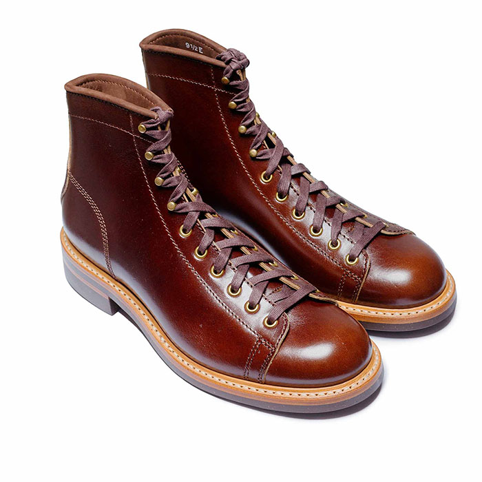 John Lofgren Monkey Boots Shinki Horsebuttt - $1,136 The classic monkey boot silhouette in an incredibly rich Shinki russet horse leather.
 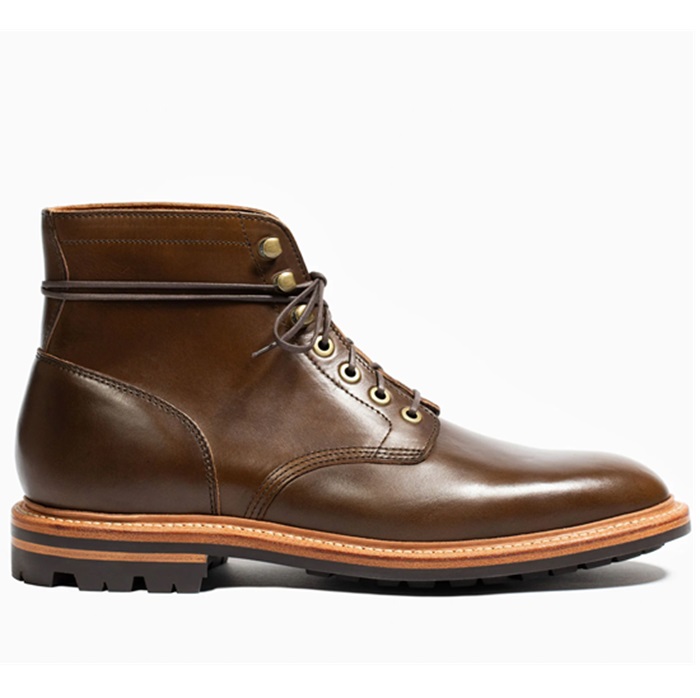 Grant Stone Diesel Boot Dark Olive Chromexcel - $395 Goodyear welted, Horween Chromexcel, classic good looks.
 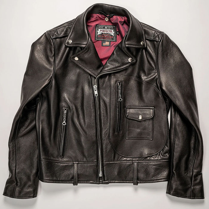 Schott 568 Vandals Jacket - $1,250 The classic Perfecto motorcycle jacket, in a very special limited-edition Schott double rider style.
 nice breakdown hbk!

most versatile 'colour' ever perhaps ?
A well-matching outfit should not betray that it was thought through excessively.
Definitely! Color of the universe.
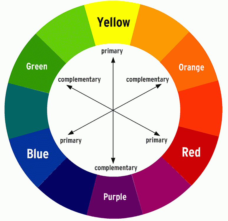
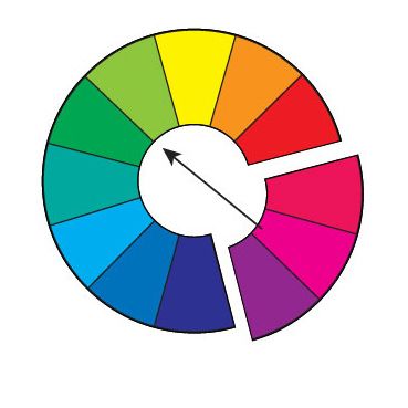
complementary colours are those which are opposite each other on the colour wheel: . . . . because they are direct opposites they have the most amount of contrast possible.


Interesting observation. I wonder what most people did back when and how practical paying such minute attention to hues of a shirt was in the Golden Era (as Guttersnipe mentions in post 529) and is now, which suggests a reason for why few people discussed/discuss the topic? I have a hard time believing that the majority of people in the 20s-50s meticulously picked out shirt colors based on hues in relationship to their complexion because that process would be quite expensive and time-consuming. Most people's complexion then changed and now changes throughout the year--depending on their genetics, climate, and their intake of sunlight amongst other reasons--so not only would people need different colored suits and shirts for different seasons, but they would need different hues of the same color shirts/suits as well. I cannot imagine a typical working-class man standing in front of his closet in the morning thumbing through four shades of the same color shirt and holding it up to his face asking "Hmm, do I look paler, darker, or deader today?"
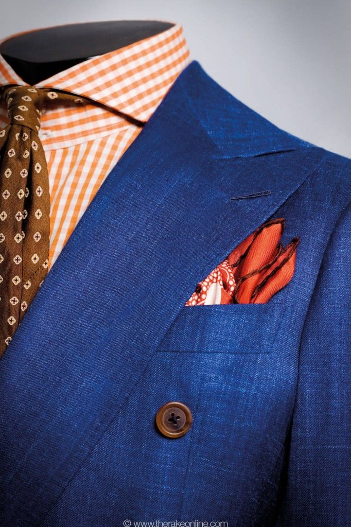
Annixter, i see the blue-yellow or blue-orange pairings as being just slight variations of the same thing. the 'complementary zone' has a bit of leeway when it comes to looking at colours of clothes with the naked eye. yellow is next to orange; either would be classed as a 'complimentary' of blue... as far as putting together an outfit goes.
I'm sure that very people paid this much attention to colors and hues every morning, especially the great majority of everyday workaday people.
Back then, men put on wool trousers, and a collared shirt, and a jacket to just pretty much step out the front door. That was the norm then, much the way today's norm is a t-shirt and sweat pants, or 'athletic' suit. Mindsets were different. What men wear today as casual wear would've been looked at by most men back then as stuff from another planet, or a science fiction motion picture.
So most men today who throw on whatever to go about their daily chores would've been matched by most men back then who did the same thing, except with the different clothing of the era. Anyway, that's my take on it.
It doesn't take much time to hold a shirt up to your face and you aren't charged more for a shirt because it's a better color for you.I have a hard time believing that the majority of people in the 20s-50s meticulously picked out shirt colors based on hues in relationship to their complexion because that process would be quite expensive and time-consuming.
No, the colors that suit you best are worn year around.Most people's complexion then changed and now changes throughout the year--depending on their genetics, climate, and their intake of sunlight amongst other reasons--so not only would people need different colored suits and shirts for different seasons, but they would need different hues of the same color shirts/suits as well.
You choose the most suitable colors sans tan and they will remain effective even when you're tan.I tan easily in the summer and then pale during the winter, so I'm more concerned with the balance in proportions and compliment of general color choices than I am with the nuances of my complexion.