thunderw21
I'll Lock Up
- Messages
- 4,044
- Location
- Iowa
I wrote this for my blog but I find color so fascinating that I thought I'd post it here. I know a lot of folks here have similar feelings about color.
I love vintage color, there's just something about it we rarely find today.
I love vintage color, there's just something about it we rarely find today.
The Color of Life
For me, at least at the moment, color is perhaps one of the most important aspects of an attractive 'kit' or outfit. Color can be dull or exciting, colors can match or clash, express the good and bad of life. It is our tool with which we can paint the story of living.
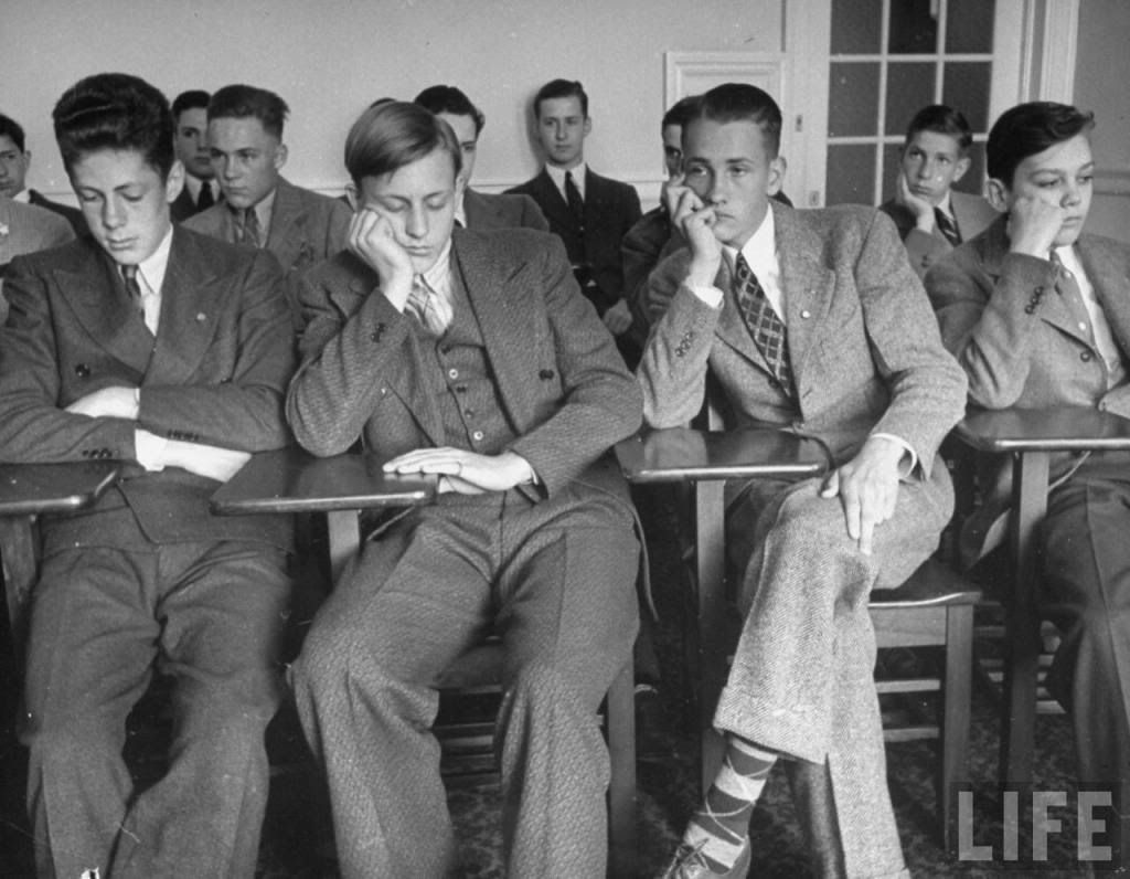
The thing about the Golden Era is that we are most exposed to it through photographs and old movies that are nearly all in black and white. Just like the photo below of the stereotypical Sunday school class, we have to guess what the colors were in most Golden Era photos:
But as a collector of vintage clothing I know the Golden Era was a colorful time, perhaps more colorful than today and I'm able to see firsthand what the colors were like. It's an exprience that few people ever knowingly have.
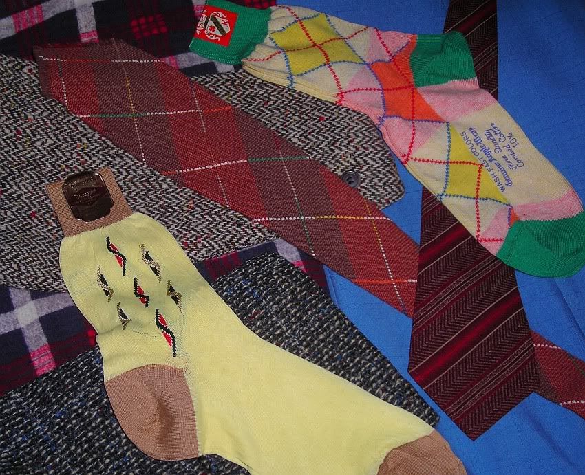
Having these pieces of color history in hand is a connection to the people who wore them. The folks in those black and white photos can seem so different, so far away from what we are today. But holding and wearing the very pieces and colors that they did offers us the ability to see that they were regular people just like us who liked a little color in life. Sometimes that color was deep and mature, other times it was wild and crazy.
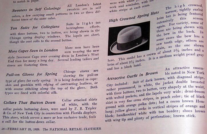
Examine the article below from the Feb. 21st, 1929 issue of the "National Retail Clothier Magazine" and pay close attention to the paragraph at the lower right entitled "Attractive Outfit in Brown":
Even the wild use of color today cannot match what this outfit must have looked like. It was something to behold not only because of the unusual combinations, but because vintage color, at least to me, seems better than color today. There were more varieties and while they were often crazy the colors were used moderately, maturely and in a handsome manner.
At times it can seem that the colors of the Golden Era are exaggerated.
Take a look at the colors and styles described in The Great Gatsby:
"He took out a pile of shirts and began throwing them, one by one, before us, shirts of sheer linen and thick silk and fine flannel, which lost their folds as they fell and covered the table in many-colored disarray. While we admired he brought more and the soft rich heap mounted higher—shirts with stripes and scrolls and plaids in coral and apple-green and lavender and faint orange, and monograms of Indian blue. Suddenly, with a strained sound, Daisy bent her head into the shirts and began to cry stormily.
“They’re such beautiful shirts,” she sobbed, her voice muffled in the thick folds. “It makes me sad because I’ve never seen such—such beautiful shirts before.”
While writers of that period were well known for their use of colors to describe certain characters and moods, it seems that the colors described in Gatsby were not too far off from the truth.
To prove my point, examine these quotes pulled from advertisements from the 1929National Retail Clothier Magazine mentioned above:
"Fancy colors that make the rainbow pale."
"...this years colorings are cream, silver, bottle, biscuit, sunburn and nutria."
"Pearl and Cedar will be the best shades, it is believed."
"Some of these ties are in bright colors."
This sounds like something Gatsby might have worn (from the scan above):
"An attractive ensemble noted in New York City included: Suit of dark brown, with diagonal stripe, rather pronounced, in white, the jacket double breasted with three buttons...demi-bosom shirt in very fine cross stripes, in peach color; tie of black ground with orange polka dots; hat a cocoa brown Homburg; yellow gloves; socks in vertical stripes of orange and black..."
"Just the right weight, in new Algerian tans, Stone greys and Lovat."
This ad speaks volumes:
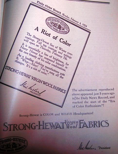
"The Era of Color Enthusiasm".
A fantastic rainbow available to the common man, some colors that most of us have never even heard of until now. Much more variety than today.
Nowadays there seems to be no rhyme nor reason for the use of color; perhaps merely to shock the eye or cause the viewer convulsions. Though, the Golden Era did have its moments like the deadstock '30s tie below shows:
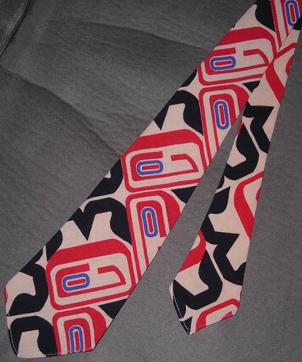
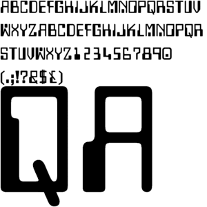
As a side note, it's interesting to compare the similarities of the patterns in the tie pictured above with the digital alphabet and number set below. This tie is a precursor to the Bold Look, but is it also a precursor to the digital age?
What was it that allowed men of the past to coordinate so many colors so well while looking mature when men of today struggle with a few basic colors? Is it a lack of manly creativity or merely a lack of good colors today?
As I close let me say that color is like a fine wine: with age it will become more flavorful and more mature. Like my vintage clothing that have years and history in their pockets and buttons, I like my colors well aged. That way I stand out in a crowd, like a twinkle of kodachrome in a black and white photograph.