Glad you like it, Ms. Morris. And don't feel that you have to have any information to contribute...if you (or anybody) come across any ads, posters, book covers, newspapers, letterhead, etc. from the era that has lettering that you find interesting, feel free to throw it up here. If I (or anyone) has insight to impart about it, then let the geeking out commence.
I've been enjoying this thread a lot! Type is everywhere, and so tends to be invisible, but in fact is really important, even if subliminal.
I'd like to see more descriptions of typefaces.
Rea Irvin was an illustrator, cartoonist, actor and musician, who was widely published in magazines of the 20s, such as the old Life. Mostly, however, he is remembered for this:
He not only drew the now-iconic image of The New Yorker's mascot, but he created the cover lettering as well. In fact, he drew up the full font of type that would be the magazines distinctive headline face, which is called, not surprisingly, "Irvin."
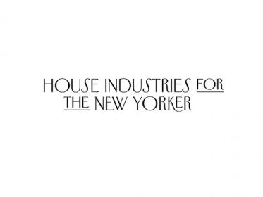
The New Yorker has recently updated it's layout and design, including the most radical redesign of its signature typestyle since the magazines inception. They've also added, for the first time ever, a third typeface aside from the text and headline faces, a sans-serif called Neutraface.
Wyatt Mitchell, the magazine's creative director, had this to say about the change:
"As we build complex content hierarchies across multiple platforms, the New Yorker's primary historic typefaces—Irvin and Caslon—prove to be tools too limited for the problems we need to solve regularly," he says. "So we've added another tool to produce the typographic tension we need to communicate more clearly, more consistently."
This, best beloved, is how full-color magazine creative directors always talk.
The new version of Irvin is a bit lighter in color (thinner) and a bit fussier in texture (higher contrast between the thick and thin strokes, and more pronounced corners). Curiously, it has become a little more eccentric, with a variety of ligatures (combined letters) and raised capitals (the ones with the lines under), and emphasizing the jazz age eccentricities of the face. In modern design, the trend is usually to smooth out the idiosyncrasies, making types more "consistent" and in line with accepted "standards" and theories of "effective" design (my own feelings about this approach are probably obvious from the bevy of quote marks I used back there).
I'm still on the fence as to what I think of the redesign. A publication as venerable T.N.Y. always has to walk a balance between preserving its traditions and not getting into stale ruts. I might be prone to say that if they want to try something new, they might inject a little more lifeblood into their fiction, or cut some of the deadwood from the cartoons. But I'm willing to give it a chance, for now.
Wyatt Mitchell, the magazine's creative director, had this to say about the change:
"As we build complex content hierarchies across multiple platforms, the New Yorker's primary historic typefaces—Irvin and Caslon—prove to be tools too limited for the problems we need to solve regularly," he says. "So we've added another tool to produce the typographic tension we need to communicate more clearly, more consistently."
This, best beloved, is how full-color magazine creative directors always talk.
My own translation is more along the lines of: "I need to justify my six-figure salary with something other than 'I was bored and needed a project,'" but let's call that an academic point.
My favorite is the Vogue typeface on Royal typewriters from the late 20s & early 30s. These were usually on odd colored Royal P-s. Google it for an example. I need one of these machines!
After a year-and-a-half hiatus, I came across this page of a 1907 type specimens book, the Barnhart Bros. Spindler Type Foundry. I finally found Degree Gothic, a sans-serif I had long admired from an old Wanamaker catalogue, and now I know what it is.
This site uses cookies to help personalise content, tailor your experience and to keep you logged in if you register.
By continuing to use this site, you are consenting to our use of cookies.
")