MondoFW
Practically Family
- Messages
- 852
Personally not a fan of the new aesthetic, especially the light tone. However, change is change. The articles section is interesting, though.
Yeah, I already miss the old header image. And I liked having the "Watched Threads" link on the Forums page; it made it very easy to locate the list of threads I was interested in. I finally found the link to that after searching for a while, but still stumbled onto it mostly by accident.View attachment 118136
I like this!
 ) Having said that, I don't mind the ads really.
A guy can't even relax & smoke a cigar in here.Found the light bulb thingy, it's better but I feel as though the management has thrown out the old comfortable leather club chairs & replaced them with brand new faux leather IKEA stuff..
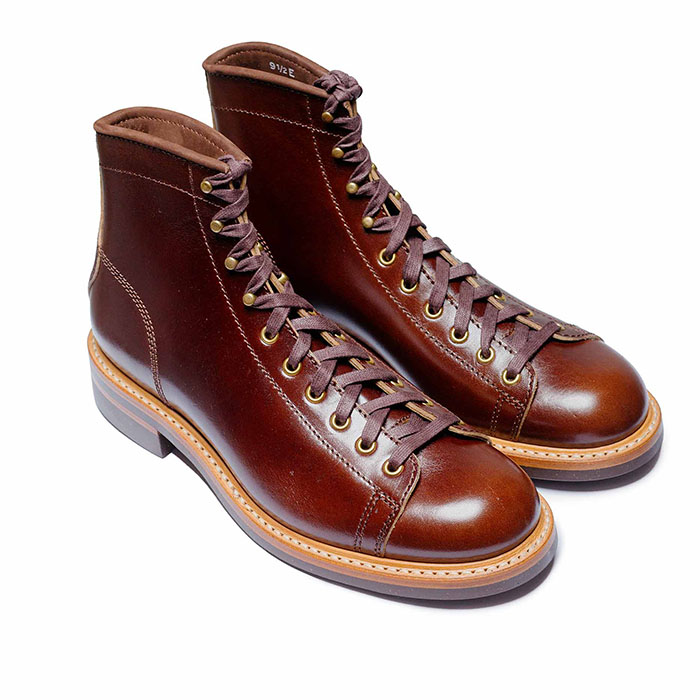 John Lofgren Monkey Boots Shinki Horsebuttt - $1,136 The classic monkey boot silhouette in an incredibly rich Shinki russet horse leather.
 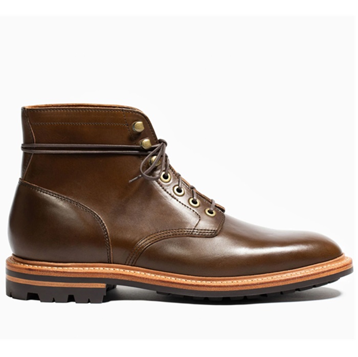 Grant Stone Diesel Boot Dark Olive Chromexcel - $395 Goodyear welted, Horween Chromexcel, classic good looks.
 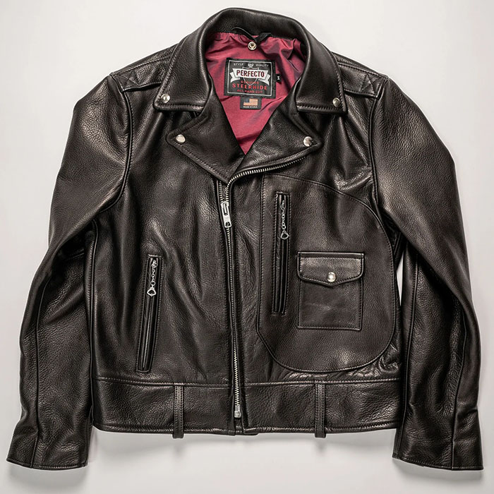 Schott 568 Vandals Jacket - $1,250 The classic Perfecto motorcycle jacket, in a very special limited-edition Schott double rider style.
 ...white on a deep coffee colour...
... time for me to go again?
ok....no problem
Yes, me too. I'm using the dark; it's close enough to the old to not be a shock to the system, but still feels fresh and clean, which I'm enjoying. I know it's hard to sell a lot of people round here on this notion, but change can be good!I am enjoying this upgrade!


How many dresses can a guy buy !